Spune-mi ce cauți și îți arăt rapid produse care merită atenția ta.
Cauți ceva anume sau vrei idei mai bune decât ce ai găsit deja? Scrie în chat, iar Shoppu îți recomandă produse reale din catalog, alternative relevante și variante mai potrivite pentru bugetul tău.
- 479.747produse active în catalog
- 1603categorii din care poți porni rapid
- 24.04.2026 19:19ultimul refresh automat al catalogului
Categorii din care poți porni imediat
Alege o categorie care te interesează sau scrie direct în chat ce vrei să găsești. Te ajut să restrângem rapid opțiunile bune.
Cum te ajută Shoppu să găsești mai repede ce cauți
Poți porni cu un produs, o categorie, un buget sau doar cu o idee generală.
Îți arăt produse concrete din catalog, nu exemple vagi sau recomandări inventate.
Poți cere variante mai ieftine, mai bune, mai populare sau mai potrivite pentru nevoia ta.
Exemple de produse pe care le poți explora acum
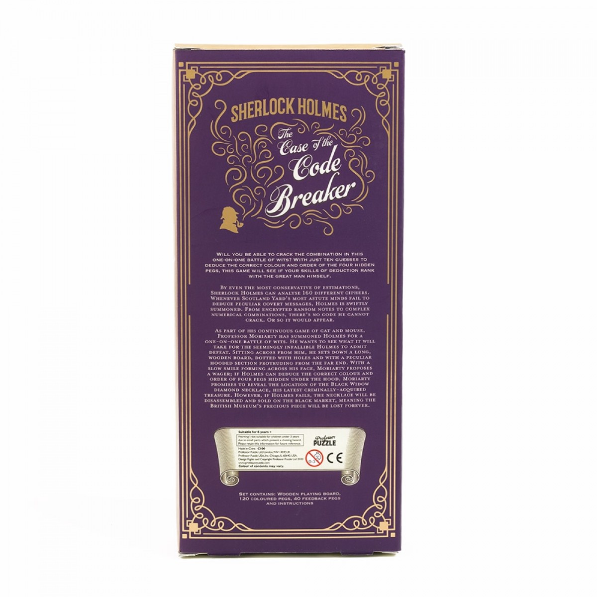
Joc - The Case of the Code Breaker | Professor Puzzle
Moriarty l-a provocat pe Holmes la batalia finala unu-la-unu de inteligenti si va avea nevoie de toate abilitatile infa…
100,00 lei

Hellboy Universe | Mike Mignola
Longstanding mysteries from the Mignolaverse, finally solved in this collection of standalone stories!When did Rasputin…
189,00 lei
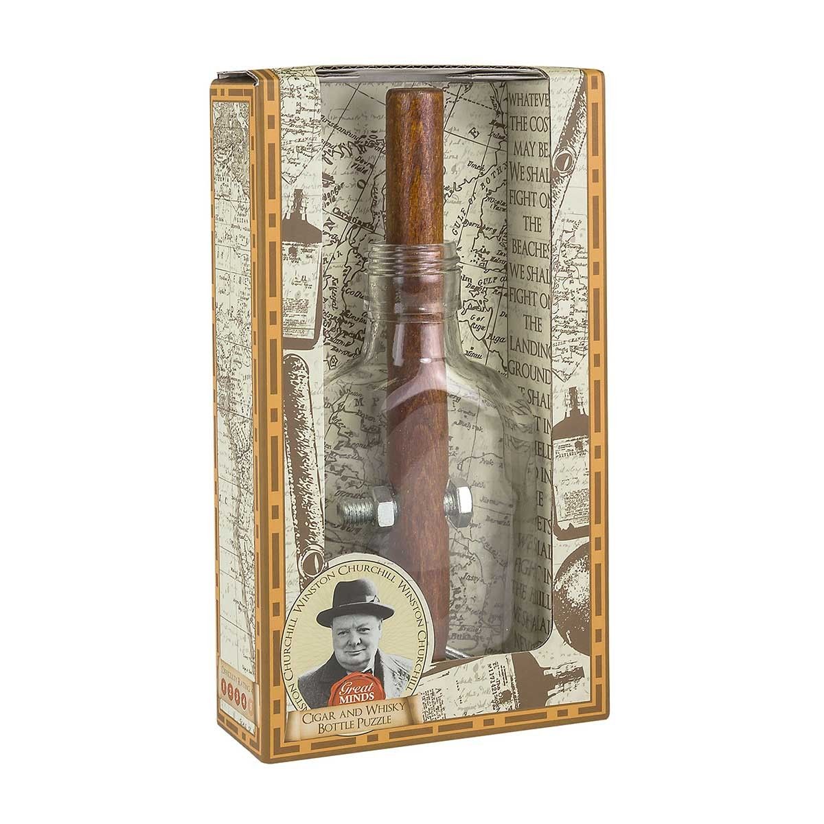
Puzzle - Churchill's Cigar and Whisky Bottle | Professor Puzzle
Winston Churchill (1874-1965), a fost Prim-ministru britanic ce a condus tara catre victoria cu Germania nazista in cel…
75,00 lei
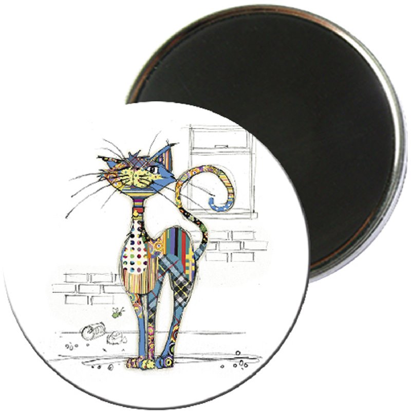
Magnet - Chat Kook | Kiub
Magnet cu design simpatic, ideal pentru frigider si alte suprafete metalice.
13,60 lei 17,00 lei
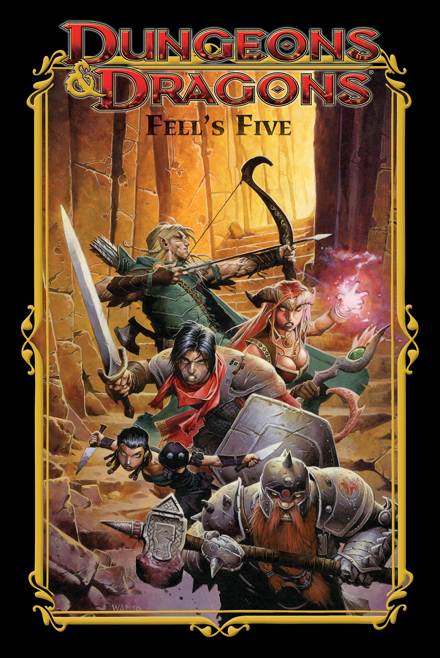
Dungeons & Dragons | John Rogers, Andrea Di Vita
Expand on your gaming experience with this graphic novel that includes three Game Adventures featuring the characters i…
189,00 lei
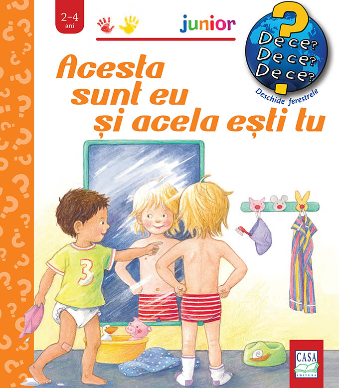
Acesta sunt eu si acela esti tu | Doris Rubel
Copiii au mii de intrebari:Cum se cheama partile corpului? Care este rolul ochilor?Ce se intampla daca suntem bolnavi?…
52,00 lei
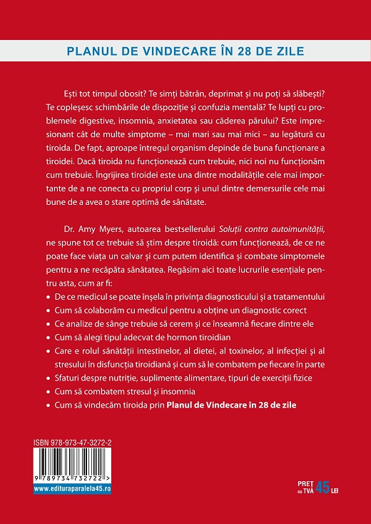
Sanatatea tiroidei | Amy Myers
Esti tot timpul obosit? Te simti batran, deprimat si nu poti sa slabesti? Te coplesesc schimbarile de dispozitie si con…
48,00 lei
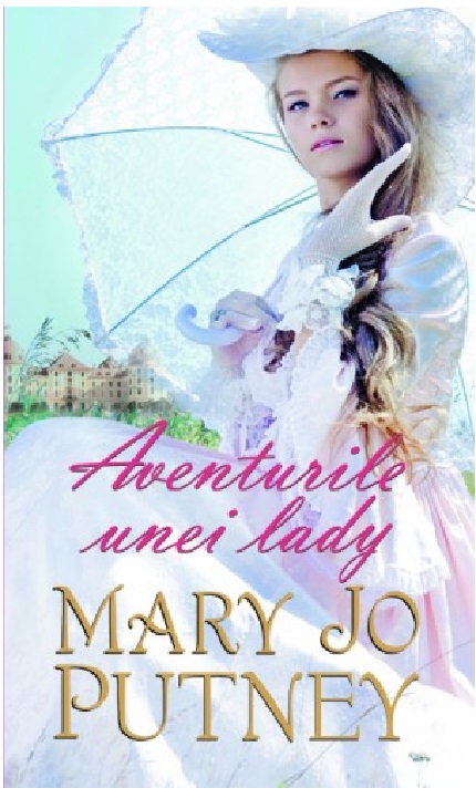
Aventurile unei lady | Mary Jo Putney
Uneori, chiar si cea mai bine-crescuta lady tanjeste dupa aventura. Cu toate acestea, domnisoara Sarah Clarke-Townsend…
29,99 lei