Spune-mi ce cauți și îți arăt rapid produse care merită atenția ta.
Cauți ceva anume sau vrei idei mai bune decât ce ai găsit deja? Scrie în chat, iar Shoppu îți recomandă produse reale din catalog, alternative relevante și variante mai potrivite pentru bugetul tău.
- 2.314.892produse active în catalog
- 5377categorii din care poți porni rapid
- 19.06.2026 02:59ultima actualizare a catalogului
Categorii din care poți porni imediat
Alege o categorie care te interesează sau scrie direct în chat ce vrei să găsești. Te ajut să restrângem rapid opțiunile bune.
Cum te ajută Shoppu să găsești mai repede ce cauți
Poți porni cu un produs, o categorie, un buget sau doar cu o idee generală.
Îți arăt produse concrete din catalog, nu exemple vagi sau recomandări inventate.
Poți cere variante mai ieftine, mai bune, mai populare sau mai potrivite pentru nevoia ta.
Exemple de produse pe care le poți explora acum
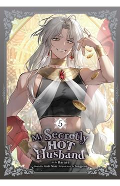
My Secretly Hot Husband, Vol. 5 -
Letitia continues her battle with Mephistel for the souls of thousands of residents of Abados. The goal--gather more ze…
99,20 lei 124,00 lei
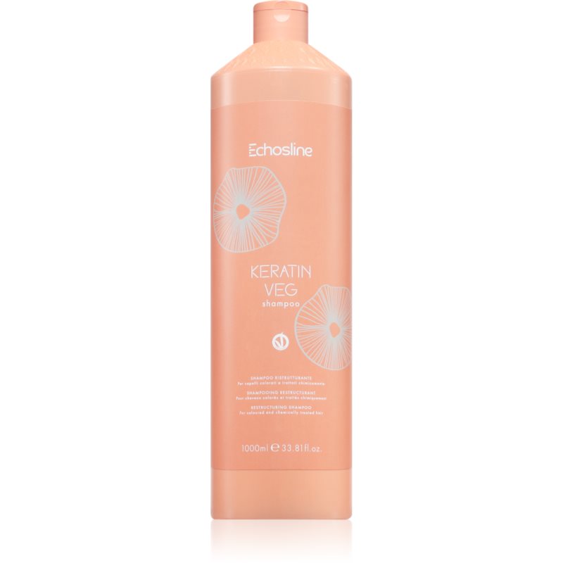
Echosline Keratin veg Shampoo sampon hranitor pentru intarirea firului de par cu aminoacizi 1000 ml
Echosline Keratin veg Shampoo, 1000 ml, Șampoane pentru femei, Pentru a vă menține părul sănătos, strălucitor și vital,…
127,00 lei

Wonderstruck
Ben's story takes place in 1977 and is told in words. Rose's story \n in 1927 is told entirely in pictures. \n \n Ever…
148,75 lei 185,94 lei
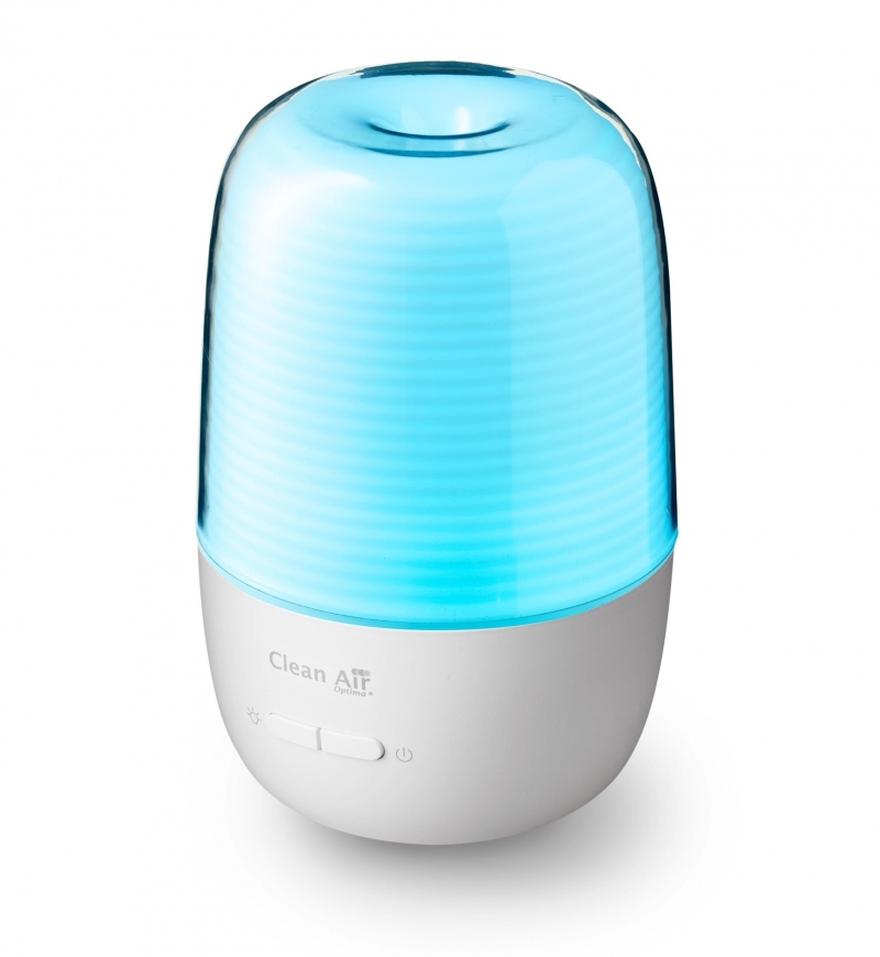
Difuzor de aroma Clean Air Optima AD-301, Lumina LED, Silentios, Capacitate rezervor 130 ml, Consum maxim 5W
Difuzorul de aromă Clean Air Optima AD-301 dispersează eficient molecule de parfum în toată încăperea, creând o atmosfe…
269,00 lei
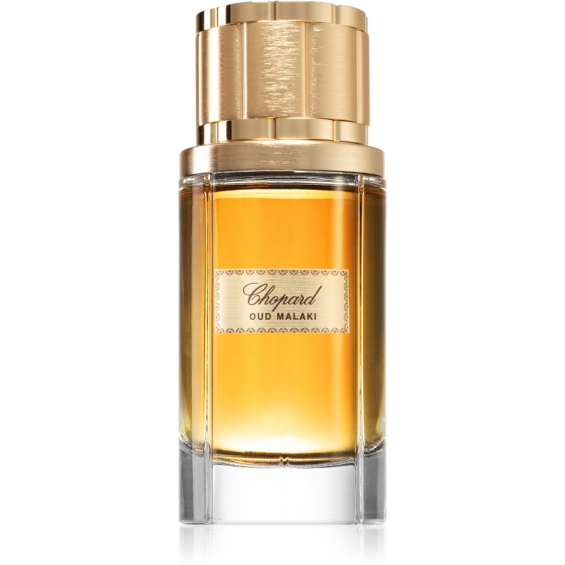
Chopard Oud Malaki Eau de Parfum pentru bărbați 80 ml
Chopard Oud Malaki, 80 ml, Apă de parfum pentru bărbați, Permiteți apei de parfum Chopard Oud Malaki să dezvăluie celor…
323,00 lei
Ancient Wisdoms for Modern Crises: Learning From Laozi's Daodejing - Steve Hallett
\nWe live in a time of abundance and comfort for some, scarcity and hardship for others-a period that seems to have all…
181,38 lei 226,72 lei

Autumn of the Grimoire: Sisters Solstice Series Book One - J. L. Vampa
\n \nSOME WITCHES CAST SPELLS, OTHERS SLAY KINGS.\n \n \n\n \nA mysterious Grimoire. A marriage full of dark secrets.…
153,17 lei 191,46 lei

I Can - Helen Oxenbury
\nHelen Oxenbury's brilliant board books have delighted a generation of babies. Now from the most widely loved of artis…
34,67 lei 43,34 lei