Spune-mi ce cauți și îți arăt rapid produse care merită atenția ta.
Cauți ceva anume sau vrei idei mai bune decât ce ai găsit deja? Scrie în chat, iar Shoppu îți recomandă produse reale din catalog, alternative relevante și variante mai potrivite pentru bugetul tău.
- 2.400.953produse active în catalog
- 1899categorii din care poți porni rapid
- 07.07.2026 22:10ultima actualizare a catalogului
Categorii din care poți porni imediat
Alege o categorie care te interesează sau scrie direct în chat ce vrei să găsești. Te ajut să restrângem rapid opțiunile bune.
Cum te ajută Shoppu să găsești mai repede ce cauți
Poți porni cu un produs, o categorie, un buget sau doar cu o idee generală.
Îți arăt produse concrete din catalog, nu exemple vagi sau recomandări inventate.
Poți cere variante mai ieftine, mai bune, mai populare sau mai potrivite pentru nevoia ta.
Exemple de produse pe care le poți explora acum
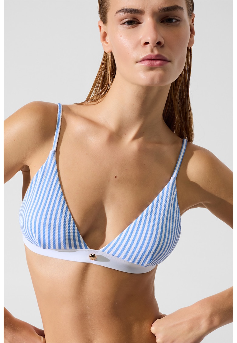
Sutien de baie cu cupe triunghiulare - Alb/Albastru
Detalii generale Tip produs: sutien Culoare: alb - albastru Imprimeu: dungi Forma cupa: triunghi Material: poliamida Ba…
239,99 lei 417,99 lei

Placa video PALIT GeForce RTX 5060 DUAL 8GB 128-Bit GDDR7 DLSS 4.0
1.880,99 lei 2.063,99 lei

Televizor LED LG 109 cm (43inch) 43UP76703LB, Ultra HD 4K, Smart TV, WiFi, CI+
Descriere Produs Resigilat EvomagStare Produs:• Prezintă urme de utilizare si nu vine impreuna cu suportul tv. Testat ș…
1.299,99 lei 1.599,99 lei
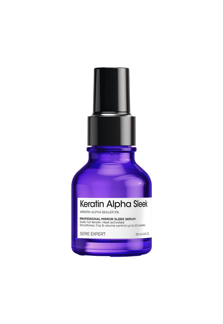
Serum profesional pentru par matasos L’Oreal Professionnel Serie Expert Keratin Alpha Sleek - pentru netezime & efect anti-electrizare - control asupra volumului - par stralucitor - protectie termica - cu Keratin-Alpha Shaper & lanturi de aminoacizi - 50
Caracteristici generale Tip produs: tratament de par Zona corporala: par Tip: clasic Tip par: normal Utilizare: zi Tip…
130,99 lei 141,99 lei
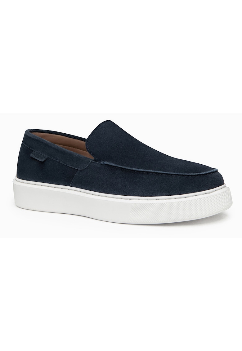
Pantofi barbati slip on din zams suede - confortabili si eleganti OM-FOCS-0246 - Bleumarin
Caracteristici Culoare: bleumarin Material: piele intoarsa Imprimeu: uni Stil: slip on Varf: rotund Detalii: fara detal…
517,73 lei 544,99 lei
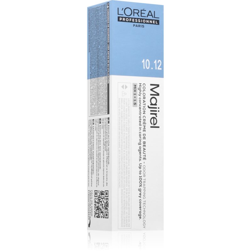
L’Oréal Professionnel Majirel Culoare permanenta pentru par culoare 10.31 60 ml
L’Oréal Professionnel Majirel, 60 ml, Vopsele de păr permanente pentru femei, Doriți să obțineți o nuanță vibrantă de l…
54,00 lei
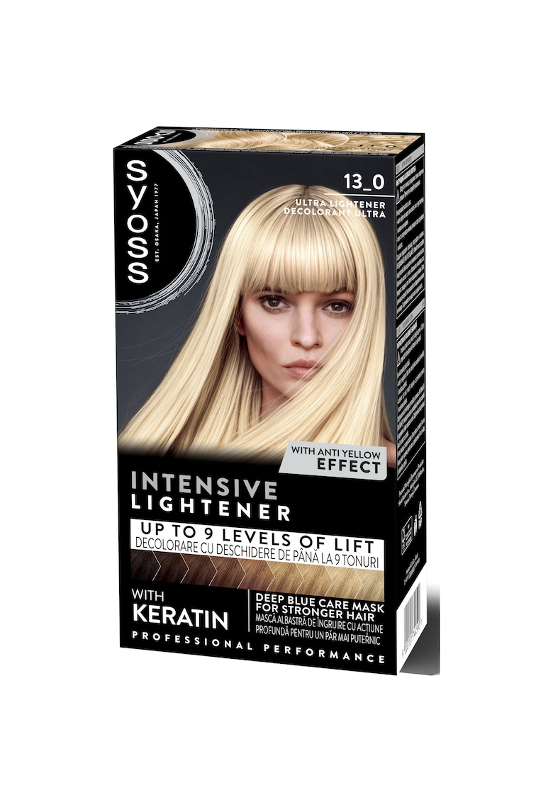
Decolorant Baseline - 13-0 Ultra Plus - 157 -5 ml
Caracteristici generale Zona corporala: par Tip: clasic Tip produs: decolorant par Rezistenta: permanenta Forma/Textura…
33,60 lei 39,99 lei
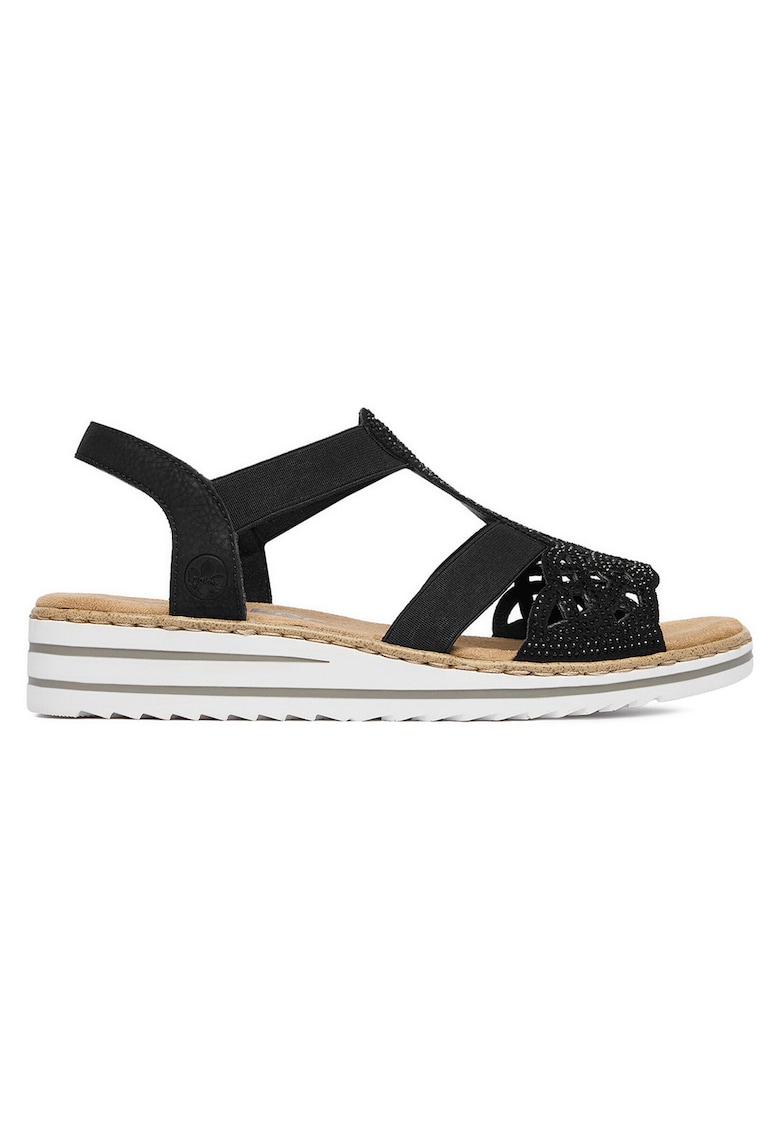
Sandale negru textil - Negru
Caracteristici Culoare: negru Material: textil Compozitie Material interior: textile
273,99 lei 301,39 lei