Spune-mi ce cauți și îți arăt rapid produse care merită atenția ta.
Cauți ceva anume sau vrei idei mai bune decât ce ai găsit deja? Scrie în chat, iar Shoppu îți recomandă produse reale din catalog, alternative relevante și variante mai potrivite pentru bugetul tău.
- 2.056.842produse active în catalog
- 5287categorii din care poți porni rapid
- 16.06.2026 02:53ultima actualizare a catalogului
Categorii din care poți porni imediat
Alege o categorie care te interesează sau scrie direct în chat ce vrei să găsești. Te ajut să restrângem rapid opțiunile bune.
Cum te ajută Shoppu să găsești mai repede ce cauți
Poți porni cu un produs, o categorie, un buget sau doar cu o idee generală.
Îți arăt produse concrete din catalog, nu exemple vagi sau recomandări inventate.
Poți cere variante mai ieftine, mai bune, mai populare sau mai potrivite pentru nevoia ta.
Exemple de produse pe care le poți explora acum
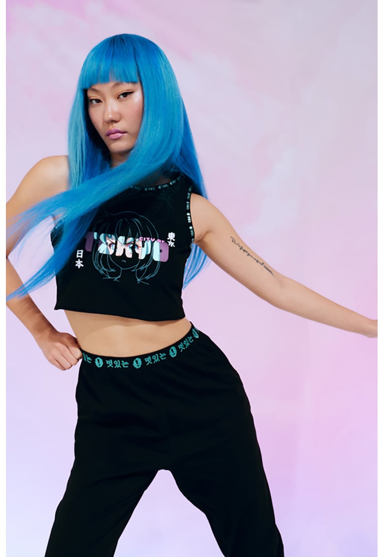
Top crop cu imprimeu - Alb/Negru
Caracteristici Tip produs: top Stil: casual Culoare: alb - negru Imprimeu: text - grafic Lungime maneca: fara maneca Ma…
31,98 lei 79,95 lei
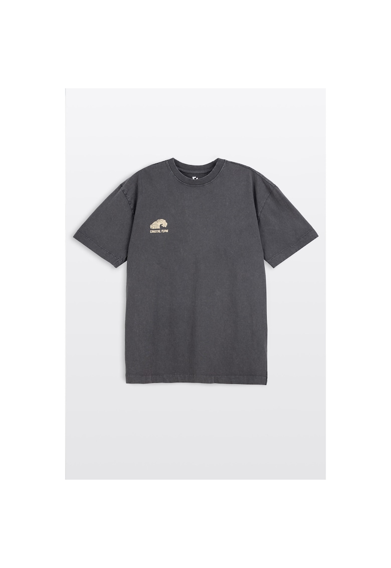
Tricou lejer din bumbac cu print
Caracteristici Culoare: gri Material: bumbac Imprimeu: text - grafic Croiala: lejer Decolteu: la baza gatului Lungime m…
69,56 lei 76,51 lei

Sacou de bumbac cu model floral - Albastru deschis
Caracteristici Culoare: albastru deschis Stil: casual Croiala: regular fit Material: bumbac Imprimeu: floral Guler: cu…
748,30 lei 1.069,00 lei

Geanta ALDO maro, SUNCHARMY 240, din piele ecologica
Geanta ALDO maro, SUNCHARMY 240, din piele ecologica , Pentru: Femei , Brand: Aldo , culoare: Maro , Material exterior:…
379,00 lei
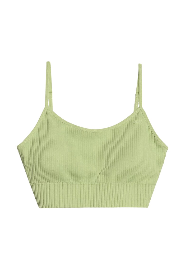
Bustiera sport F151 - poliamida/elastan - verde
Caracteristici generale Culoare: verde Sport: fitness Material: elastan - poliamida
139,42 lei 153,36 lei

vidaXL Set de masă pentru grădină cu pernă 7 pcs Negru poliratan
Setul de dining perfect pentru vară! Designul modern și funcțional îl face ideal pentru întâlniri pe terasă. Liniile si…
3.528,99 lei

Divinia - Strânsoare de încheieturi 1 buc
Material: PVC + metal + poliuretanDetalii produs:Lungime: aprox. 35 cmLungime reglabilă: 20 - 30 cmLățime: aprox. 6 cmG…
129,25 lei
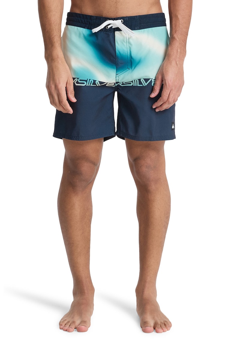
Pantaloni scurti de baie Everyday 16"" - Alb/Albastru
Caracteristici Tip produs: pantaloni scurti Culoare: alb - albastru Material: sintetic Imprimeu: logo - tie-dye Buzunar…
128,99 lei 141,89 lei