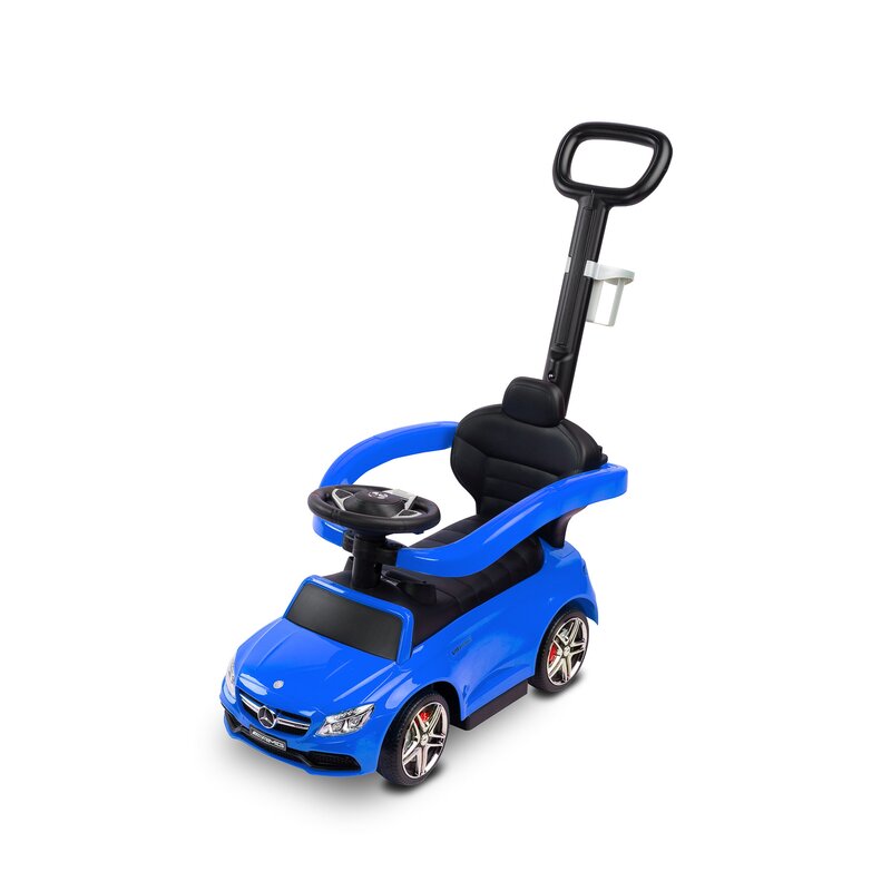
.bd-grid { display: grid; display: grid; grid-template-columns: repeat(3, minmax(0, 1fr)); row-gap: 50px; column-gap: 50px; justify-items: center; text-align: center; } @media screen and (max-width: 600px) { .bd-grid { display: grid; grid-template-columns: repeat(1, minmax(0, 1fr)); } } .bd-grid-s { display: grid; display: grid; grid-template-columns: repeat(2, minmax(0, 1fr)); row-gap: 50px; column-gap: 50px; justify-items: center; text-align: center; align-items: center; } @media screen and (max-width: 600px) { .bd-grid-s { display: grid; grid-template-columns: repeat(1, minmax(0, 1fr)); } } MASINUTA RIDE-ON MERCEDES SLS AMG Constructie sigura, stabila si durabila Volan multimedia Spatiu de depozitare sub scaun Jante stilizate Element anti-rasturnare INVATAREA PRIN JOACA Masinuta Ride-On este o jucarie excelenta care va dezvolta abilitatile motorii, perceptia si chiar elementele de baza ale calatoriilor in siguranta in afara casei. Datorita volanului multimedia, masina atrage usor atentia celor mici. ASPECT REALIST Datorita v olanului multimedia stilizat cu logo real, certificat, este un adevarat rasfat pentru soferii mici. Pe volan exista un panou muzical cu 2 butoane pentru redarea melodiilor si un claxon. Licenta MERCEDES garanteaza reproducerea perfecta a masinii si calitatea inalta a materialelor utilizate. Farurile, grila si jantele sunt stilate ca la masini adevarate! Datorita acestui lucru, atrage atentia si devine rapid o jucarie preferata acasa si la plimbare. . SIGURANTA ESTE PE PRIMUL LOC Datorita unui „picior” special montat in spatele calatorului, copilul este complet in siguranta. Acesta blocheaza vehiculul impotriva rasturnarii ; intr-o situatie periculoasa, blocajul se sprijina pe sol si stabilizeaza rularea. DEPOZITARE Sub scaun exista un compartiment de depozitare incapator care va gazdui jucariile preferate si comorile gasite in timpul plimbarilor. Datorita acestuia, micul tau sofer va avea mereu la indemana toate accesoriile necesare pentru a se juca. .bd-grid { display: grid; display: grid; grid-template-columns: repeat(3, minmax(0, 1fr)); row-gap: 50px; column-gap: 50px; justify-items: center; text-align: center; } @media screen and (max-width: 600px) { .bd-grid { display: grid; grid-template-columns: repeat(1, minmax(0, 1fr)); } } .bd-grid-s { display: grid; display: grid; grid-template-columns: repeat(2, minmax(0, 1fr)); row-gap: 50px; column-gap: 50px; justify-items: center; text-align: center; align-items: center; } @media screen and (max-width: 600px) { .bd-grid-s { display: grid; grid-template-columns: repeat(1, minmax(0, 1fr)); } } .bd-grid { display: grid; display: grid; grid-template-columns: repeat(3, minmax(0, 1fr)); row-gap: 50px; column-gap: 50px; justify-items: center; text-align: center; } @media screen and (max-width: 600px) { .bd-grid { display: grid; grid-template-columns: repeat(1, minmax(0, 1fr)); } } .bd-grid-s { display: grid; display: grid; grid-template-columns: repeat(2, minmax(0, 1fr)); row-gap: 50px; column-gap: 50px; justify-items: center; text-align: center; align-items: center; } @media screen and (max-width: 600px) { .bd-grid-s { display: grid; grid-template-columns: repeat(1, minmax(0, 1fr)); } } .bd-grid { display: grid; display: grid; grid-template-columns: repeat(3, minmax(0, 1fr)); row-gap: 50px; column-gap: 50px; justify-items: center; text-align: center; } @media screen and (max-width: 600px) { .bd-grid { display: grid; grid-template-columns: repeat(1, minmax(0, 1fr)); } } .bd-grid-s { display: grid; display: grid; grid-template-columns: repeat(2, minmax(0, 1fr)); row-gap: 50px; column-gap: 50px; justify-items: center; text-align: center; align-items: center; } @media screen and (max-width: 600px) { .bd-grid-s { display: grid; grid-template-columns: repeat(1, minmax(0, 1fr)); } } .bd-grid { display: grid; display: grid; grid-template-columns: repeat(3, minmax(0, 1fr)); row-gap: 50px; column-gap: 50px; justify-items: center; text-align: center; } @media screen and (max-width: 600px) { .bd-grid { display: grid; grid-template-columns: repeat(1, minmax(0, 1fr)); } } .bd-grid-s { display: grid; display: grid; grid-template-columns: repeat(2, minmax(0, 1fr)); row-gap: 50px; column-gap: 50px; justify-items: center; text-align: center; align-items: center; } @media screen and (max-width: 600px) { .bd-grid-s { display: grid; grid-template-columns: repeat(1, minmax(0, 1fr)); } } .bd-grid { display: grid; display: grid; grid-template-columns: repeat(3, minmax(0, 1fr)); row-gap: 50px; column-gap: 50px; justify-items: center; text-align: center; } @media screen and (max-width: 600px) { .bd-grid { display: grid; grid-template-columns: repeat(1, minmax(0, 1fr)); } } .bd-grid-s { display: grid; display: grid; grid-template-columns: repeat(2, minmax(0, 1fr)); row-gap: 50px; column-gap: 50px; justify-items: center; text-align: center; align-items: center; } @media screen and (max-width: 600px) { .bd-grid-s { display: grid; grid-template-columns: repeat(1, minmax(0, 1fr)); } } .bd-grid { display: grid; display: grid; grid-template-columns: repeat(3, minmax(0, 1fr)); row-gap: 50px; column-gap: 50px; justify-items: center; text-align: center; } @media screen and (max-width: 600px) { .bd-grid { display: grid; grid-template-columns: repeat(1, minmax(0, 1fr)); } } .bd-grid-s { display: grid; display: grid; grid-template-columns: repeat(2, minmax(0, 1fr)); row-gap: 50px; column-gap: 50px; justify-items: center; text-align: center; align-items: center; } @media screen and (max-width: 600px) { .bd-grid-s { display: grid; grid-template-columns: repeat(1, minmax(0, 1fr)); } } .bd-grid { display: grid; display: grid; grid-template-columns: repeat(3, minmax(0, 1fr)); row-gap: 50px; column-gap: 50px; justify-items: center; text-align: center; } @media screen and (max-width: 600px) { .bd-grid { display: grid; grid-template-columns: repeat(1, minmax(0, 1fr)); } } .bd-grid-s { display: grid; display: grid; grid-template-columns: repeat(2, minmax(0, 1fr)); row-gap: 50px; column-gap: 50px; justify-items: center; text-align: center; align-items: center; } @media screen and (max-width: 600px) { .bd-grid-s { display: grid; grid-template-columns: repeat(1, minmax(0, 1fr)); } } .bd-grid { display: grid; display: grid; grid-template-columns: repeat(3, minmax(0, 1fr)); row-gap: 50px; column-gap: 50px; justify-items: center; text-align: center; } @media screen and (max-width: 600px) { .bd-grid { display: grid; grid-template-columns: repeat(1, minmax(0, 1fr)); } } .bd-grid-s { display: grid; display: grid; grid-template-columns: repeat(2, minmax(0, 1fr)); row-gap: 50px; column-gap: 50px; justify-items: center; text-align: center; align-items: center; } @media screen and (max-width: 600px) { .bd-grid-s { display: grid; grid-template-columns: repeat(1, minmax(0, 1fr)); } } .bd-grid { display: grid; display: grid; grid-template-columns: repeat(3, minmax(0, 1fr)); row-gap: 50px; column-gap: 50px; justify-items: center; text-align: center; } @media screen and (max-width: 600px) { .bd-grid { display: grid; grid-template-columns: repeat(1, minmax(0, 1fr)); } } .bd-grid-s { display: grid; display: grid; grid-template-columns: repeat(2, minmax(0, 1fr)); row-gap: 50px; column-gap: 50px; justify-items: center; text-align: center; align-items: center; } @media screen and (max-width: 600px) { .bd-grid-s { display: grid; grid-template-columns: repeat(1, minmax(0, 1fr)); } } .bd-grid { display: grid; display: grid; grid-template-columns: repeat(3, minmax(0, 1fr)); row-gap: 50px; column-gap: 50px; justify-items: center; text-align: center; } @media screen and (max-width: 600px) { .bd-grid { display: grid; grid-template-columns: repeat(1, minmax(0, 1fr)); } } .bd-grid-s { display: grid; display: grid; grid-template-columns: repeat(2, minmax(0, 1fr)); row-gap: 50px; column-gap: 50px; justify-items: center; text-align: center; align-items: center; } @media screen and (max-width: 600px) { .bd-grid-s { display: grid; grid-template-columns: repeat(1, minmax(0, 1fr)); } } .bd-grid { display: grid; display: grid; grid-template-columns: repeat(3, minmax(0, 1fr)); row-gap: 50px; column-gap: 50px; justify-items: center; text-align: center; } @media screen and (max-width: 600px) { .bd-grid { display: grid; grid-template-columns: repeat(1, minmax(0, 1fr)); } } .bd-grid-s { display: grid; display: grid; grid-template-columns: repeat(2, minmax(0, 1fr)); row-gap: 50px; column-gap: 50px; justify-items: center; text-align: center; align-items: center; } @media screen and (max-width: 600px) { .bd-grid-s { display: grid; grid-template-columns: repeat(1, minmax(0, 1fr)); } } .bd-grid { display: grid; display: grid; grid-template-columns: repeat(3, minmax(0, 1fr)); row-gap: 50px; column-gap: 50px; justify-items: center; text-align: center; } @media screen and (max-width: 600px) { .bd-grid { display: grid; grid-template-columns: repeat(1, minmax(0, 1fr)); } } .bd-grid-s { display: grid; display: grid; grid-template-columns: repeat(2, minmax(0, 1fr)); row-gap: 50px; column-gap: 50px; justify-items: center; text-align: center; align-items: center; } @media screen and (max-width: 600px) { .bd-grid-s { display: grid; grid-template-columns: repeat(1, minmax(0, 1fr)); } } .bd-grid { display: grid; display: grid; grid-template-columns: repeat(3, minmax(0, 1fr)); row-gap: 50px; column-gap: 50px; justify-items: center; text-align: center; } @media screen and (max-width: 600px) { .bd-grid { display: grid; grid-template-columns: repeat(1, minmax(0, 1fr)); } } .bd-grid-s { display: grid; display: grid; grid-template-columns: repeat(2, minmax(0, 1fr)); row-gap: 50px; column-gap: 50px; justify-items: center; text-align: center; align-items: center; } @media screen and (max-width: 600px) { .bd-grid-s { display: grid; grid-template-columns: repeat(1, minmax(0, 1fr)); } } .bd-grid { display: grid; display: grid; grid-template-columns: repeat(3, minmax(0, 1fr)); row-gap: 50px; column-gap: 50px; justify-items: center; text-align: center; } @media screen and (max-width: 600px) { .bd-grid { display: grid; grid-template-columns: repeat(1, minmax(0, 1fr)); } } .bd-grid-s { display: grid; display: grid; grid-template-columns: repeat(2, minmax(0, 1fr)); row-gap: 50px; column-gap: 50px; justify-items: center; text-align: center; align-items: center; } @media screen and (max-width: 600px) { .bd-grid-s { display: grid; grid-template-columns: repeat(1, minmax(0, 1fr)); } } .bd-grid { display: grid; display: grid; grid-template-columns: repeat(3, minmax(0, 1fr)); row-gap: 50px; column-gap: 50px; justify-items: center; text-align: center; } @media screen and (max-width: 600px) { .bd-grid { display: grid; grid-template-columns: repeat(1, minmax(0, 1fr)); } } .bd-grid-s { display: grid; display: grid; grid-template-columns: repeat(2, minmax(0, 1fr)); row-gap: 50px; column-gap: 50px; justify-items: center; text-align: center; align-items: center; } @media screen and (max-width: 600px) { .bd-grid-s { display: grid; grid-template-columns: repeat(1, minmax(0, 1fr)); } } .bd-grid { display: grid; display: grid; grid-template-columns: repeat(3, minmax(0, 1fr)); row-gap: 50px; column-gap: 50px; justify-items: center; text-align: center; } @media screen and (max-width: 600px) { .bd-grid { display: grid; grid-template-columns: repeat(1, minmax(0, 1fr)); } } .bd-grid-s { display: grid; display: grid; grid-template-columns: repeat(2, minmax(0, 1fr)); row-gap: 50px; column-gap: 50px; justify-items: center; text-align: center; align-items: center; } @media screen and (max-width: 600px) { .bd-grid-s { display: grid; grid-template-columns: repeat(1, minmax(0, 1fr)); } } .bd-grid { display: grid; display: grid; grid-template-columns: repeat(3, minmax(0, 1fr)); row-gap: 50px; column-gap: 50px; justify-items: center; text-align: center; } @media screen and (max-width: 600px) { .bd-grid { display: grid; grid-template-columns: repeat(1, minmax(0, 1fr)); } } .bd-grid-s { display: grid; display: grid; grid-template-columns: repeat(2, minmax(0, 1fr)); row-gap: 50px; column-gap: 50px; justify-items: center; text-align: center; align-items: center; } @media screen and (max-width: 600px) { .bd-grid-s { display: grid; grid-template-columns: repeat(1, minmax(0, 1fr)); } } .bd-grid { display: grid; display: grid; grid-template-columns: repeat(3, minmax(0, 1fr)); row-gap: 50px; column-gap: 50px; justify-items: center; text-align: center; } @media screen and (max-width: 600px) { .bd-grid { display: grid; grid-template-columns: repeat(1, minmax(0, 1fr)); } } .bd-grid-s { display: grid; display: grid; grid-template-columns: repeat(2, minmax(0, 1fr)); row-gap: 50px; column-gap: 50px; justify-items: center; text-align: center; align-items: center; } @media screen and (max-width: 600px) { .bd-grid-s { display: grid; grid-template-columns: repeat(1, minmax(0, 1fr)); } } .bd-grid { display: grid; display: grid; grid-template-columns: repeat(3, minmax(0, 1fr)); row-gap: 50px; column-gap: 50px; justify-items: center; text-align: center; } @media screen and (max-width: 600px) { .bd-grid { display: grid; grid-template-columns: repeat(1, minmax(0, 1fr)); } } .bd-grid-s { display: grid; display: grid; grid-template-columns: repeat(2, minmax(0, 1fr)); row-gap: 50px; column-gap: 50px; justify-items: center; text-align: center; align-items: center; } @media screen and (max-width: 600px) { .bd-grid-s { display: grid; grid-template-columns: repeat(1, minmax(0, 1fr)); } } .bd-grid { display: grid; display: grid; grid-template-columns: repeat(3, minmax(0, 1fr)); row-gap: 50px; column-gap: 50px; justify-items: center; text-align: center; } @media screen and (max-width: 600px) { .bd-grid { display: grid; grid-template-columns: repeat(1, minmax(0, 1fr)); } } .bd-grid-s { display: grid; display: grid; grid-template-columns: repeat(2, minmax(0, 1fr)); row-gap: 50px; column-gap: 50px; justify-items: center; text-align: center; align-items: center; } @media screen and (max-width: 600px) { .bd-grid-s { display: grid; grid-template-columns: repeat(1, minmax(0, 1fr)); } } .bd-grid { display: grid; display: grid; grid-template-columns: repeat(3, minmax(0, 1fr)); row-gap: 50px; column-gap: 50px; justify-items: center; text-align: center; } @media screen and (max-width: 600px) { .bd-grid { display: grid; grid-template-columns: repeat(1, minmax(0, 1fr)); } } .bd-grid-s { display: grid; display: grid; grid-template-columns: repeat(2, minmax(0, 1fr)); row-gap: 50px; column-gap: 50px; justify-items: center; text-align: center; align-items: center; } @media screen and (max-width: 600px) { .bd-grid-s { display: grid; grid-template-columns: repeat(1, minmax(0, 1fr)); } } .bd-grid { display: grid; display: grid; grid-template-columns: repeat(3, minmax(0, 1fr)); row-gap: 50px; column-gap: 50px; justify-items: center; text-align: center; } @media screen and (max-width: 600px) { .bd-grid { display: grid; grid-template-columns: repeat(1, minmax(0, 1fr)); } } .bd-grid-s { display: grid; display: grid; grid-template-columns: repeat(2, minmax(0, 1fr)); row-gap: 50px; column-gap: 50px; justify-items: center; text-align: center; align-items: center; } @media screen and (max-width: 600px) { .bd-grid-s { display: grid; grid-template-columns: repeat(1, minmax(0, 1fr)); } } .bd-grid { display: grid; display: grid; grid-template-columns: repeat(3, minmax(0, 1fr)); row-gap: 50px; column-gap: 50px; justify-items: center; text-align: center; } @media screen and (max-width: 600px) { .bd-grid { display: grid; grid-template-columns: repeat(1, minmax(0, 1fr)); } } .bd-grid-s { display: grid; display: grid; grid-template-columns: repeat(2, minmax(0, 1fr)); row-gap: 50px; column-gap: 50px; justify-items: center; text-align: center; align-items: center; } @media screen and (max-width: 600px) { .bd-grid-s { display: grid; grid-template-columns: repeat(1, minmax(0, 1fr)); } } .bd-grid { display: grid; display: grid; grid-template-columns: repeat(3, minmax(0, 1fr)); row-gap: 50px; column-gap: 50px; justify-items: center; text-align: center; } @media screen and (max-width: 600px) { .bd-grid { display: grid; grid-template-columns: repeat(1, minmax(0, 1fr)); } } .bd-grid-s { display: grid; display: grid; grid-template-columns: repeat(2, minmax(0, 1fr)); row-gap: 50px; column-gap: 50px; justify-items: center; text-align: center; align-items: center; } @media screen and (max-width: 600px) { .bd-grid-s { display: grid; grid-template-columns: repeat(1, minmax(0, 1fr)); } } .bd-grid { display: grid; display: grid; grid-template-columns: repeat(3, minmax(0, 1fr)); row-gap: 50px; column-gap: 50px; justify-items: center; text-align: center; } @media screen and (max-width: 600px) { .bd-grid { display: grid; grid-template-columns: repeat(1, minmax(0, 1fr)); } } .bd-grid-s { display: grid; display: grid; grid-template-columns: repeat(2, minmax(0, 1fr)); row-gap: 50px; column-gap: 50px; justify-items: center; text-align: center; align-items: center; } @media screen and (max-width: 600px) { .bd-grid-s { display: grid; grid-template-columns: repeat(1, minmax(0, 1fr)); } } .bd-grid { display: grid; display: grid; grid-template-columns: repeat(3, minmax(0, 1fr)); row-gap: 50px; column-gap: 50px; justify-items: center; text-align: center; } @media screen and (max-width: 600px) { .bd-grid { display: grid; grid-template-columns: repeat(1, minmax(0, 1fr)); } } .bd-grid-s { display: grid; display: grid; grid-template-columns: repeat(2, minmax(0, 1fr)); row-gap: 50px; column-gap: 50px; justify-items: center; text-align: center; align-items: center; } @media screen and (max-width: 600px) { .bd-grid-s { display: grid; grid-template-columns: repeat(1, minmax(0, 1fr)); } } .bd-grid { display: grid; display: grid; grid-template-columns: repeat(3, minmax(0, 1fr)); row-gap: 50px; column-gap: 50px; justify-items: center; text-align: center; } @media screen and (max-width: 600px) { .bd-grid { display: grid; grid-template-columns: repeat(1, minmax(0, 1fr)); } } .bd-grid-s { display: grid; display: grid; grid-template-columns: repeat(2, minmax(0, 1fr)); row-gap: 50px; column-gap: 50px; justify-items: center; text-align: center; align-items: center; } @media screen and (max-width: 600px) { .bd-grid-s { display: grid; grid-template-columns: repeat(1, minmax(0, 1fr)); } } .bd-grid { display: grid; display: grid; grid-template-columns: repeat(3, minmax(0, 1fr)); row-gap: 50px; column-gap: 50px; justify-items: center; text-align: center; } @media screen and (max-width: 600px) { .bd-grid { display: grid; grid-template-columns: repeat(1, minmax(0, 1fr)); } } .bd-grid-s { display: grid; display: grid; grid-template-columns: repeat(2, minmax(0, 1fr)); row-gap: 50px; column-gap: 50px; justify-items: center; text-align: center; align-items: center; } @media screen and (max-width: 600px) { .bd-grid-s { display: grid; grid-template-columns: repeat(1, minmax(0, 1fr)); } } .bd-grid { display: grid; display: grid; grid-template-columns: repeat(3, minmax(0, 1fr)); row-gap: 50px; column-gap: 50px; justify-items: center; text-align: center; } @media screen and (max-width: 600px) { .bd-grid { display: grid; grid-template-columns: repeat(1, minmax(0, 1fr)); } } .bd-grid-s { display: grid; display: grid; grid-template-columns: repeat(2, minmax(0, 1fr)); row-gap: 50px; column-gap: 50px; justify-items: center; text-align: center; align-items: center; } @media screen and (max-width: 600px) { .bd-grid-s { display: grid; grid-template-columns: repeat(1, minmax(0, 1fr)); } } .bd-grid { display: grid; display: grid; grid-template-columns: repeat(3, minmax(0, 1fr)); row-gap: 50px; column-gap: 50px; justify-items: center; text-align: center; } @media screen and (max-width: 600px) { .bd-grid { display: grid; grid-template-columns: repeat(1, minmax(0, 1fr)); } } .bd-grid-s { display: grid; display: grid; grid-template-columns: repeat(2, minmax(0, 1fr)); row-gap: 50px; column-gap: 50px; justify-items: center; text-align: center; align-items: center; } @media screen and (max-width: 600px) { .bd-grid-s { display: grid; grid-template-columns: repeat(1, minmax(0, 1fr)); } } .bd-grid { display: grid; display: grid; grid-template-columns: repeat(3, minmax(0, 1fr)); row-gap: 50px; column-gap: 50px; justify-items: center; text-align: center; } @media screen and (max-width: 600px) { .bd-grid { display: grid; grid-template-columns: repeat(1, minmax(0, 1fr)); } } .bd-grid-s { display: grid; display: grid; grid-template-columns: repeat(2, minmax(0, 1fr)); row-gap: 50px; column-gap: 50px; justify-items: center; text-align: center; align-items: center; } @media screen and (max-width: 600px) { .bd-grid-s { display: grid; grid-template-columns: repeat(1, minmax(0, 1fr)); } } .bd-grid { display: grid; display: grid; grid-template-columns: repeat(3, minmax(0, 1fr)); row-gap: 50px; column-gap: 50px; justify-items: center; text-align: center; } @media screen and (max-width: 600px) { .bd-grid { display: grid; grid-template-columns: repeat(1, minmax(0, 1fr)); } } .bd-grid-s { display: grid; display: grid; grid-template-columns: repeat(2, minmax(0, 1fr)); row-gap: 50px; column-gap: 50px; justify-items: center; text-align: center; align-items: center; } @media screen and (max-width: 600px) { .bd-grid-s { display: grid; grid-template-columns: repeat(1, minmax(0, 1fr)); } } .bd-grid { display: grid; display: grid; grid-template-columns: repeat(3, minmax(0, 1fr)); row-gap: 50px; column-gap: 50px; justify-items: center; text-align: center; } @media screen and (max-width: 600px) { .bd-grid { display: grid; grid-template-columns: repeat(1, minmax(0, 1fr)); } } .bd-grid-s { display: grid; display: grid; grid-template-columns: repeat(2, minmax(0, 1fr)); row-gap: 50px; column-gap: 50px; justify-items: center; text-align: center; align-items: center; } @media screen and (max-width: 600px) { .bd-grid-s { display: grid; grid-template-columns: repeat(1, minmax(0, 1fr)); } } .bd-grid { display: grid; display: grid; grid-template-columns: repeat(3, minmax(0, 1fr)); row-gap: 50px; column-gap: 50px; justify-items: center; text-align: center; } @media screen and (max-width: 600px) { .bd-grid { display: grid; grid-template-columns: repeat(1, minmax(0, 1fr)); } } .bd-grid-s { display: grid; display: grid; grid-template-columns: repeat(2, minmax(0, 1fr)); row-gap: 50px; column-gap: 50px; justify-items: center; text-align: center; align-items: center; } @media screen and (max-width: 600px) { .bd-grid-s { display: grid; grid-template-columns: repeat(1, minmax(0, 1fr)); } } .bd-grid { display: grid; display: grid; grid-template-columns: repeat(3, minmax(0, 1fr)); row-gap: 50px; column-gap: 50px; justify-items: center; text-align: center; } @media screen and (max-width: 600px) { .bd-grid { display: grid; grid-template-columns: repeat(1, minmax(0, 1fr)); } } .bd-grid-s { display: grid; display: grid; grid-template-columns: repeat(2, minmax(0, 1fr)); row-gap: 50px; column-gap: 50px; justify-items: center; text-align: center; align-items: center; } @media screen and (max-width: 600px) { .bd-grid-s { display: grid; grid-template-columns: repeat(1, minmax(0, 1fr)); } } .bd-grid { display: grid; display: grid; grid-template-columns: repeat(3, minmax(0, 1fr)); row-gap: 50px; column-gap: 50px; justify-items: center; text-align: center; } @media screen and (max-width: 600px) { .bd-grid { display: grid; grid-template-columns: repeat(1, minmax(0, 1fr)); } } .bd-grid-s { display: grid; display: grid; grid-template-columns: repeat(2, minmax(0, 1fr)); row-gap: 50px; column-gap: 50px; justify-items: center; text-align: center; align-items: center; } @media screen and (max-width: 600px) { .bd-grid-s { display: grid; grid-template-columns: repeat(1, minmax(0, 1fr)); } } .bd-grid { display: grid; display: grid; grid-template-columns: repeat(3, minmax(0, 1fr)); row-gap: 50px; column-gap: 50px; justify-items: center; text-align: center; } @media screen and (max-width: 600px) { .bd-grid { display: grid; grid-template-columns: repeat(1, minmax(0, 1fr)); } } .bd-grid-s { display: grid; display: grid; grid-template-columns: repeat(2, minmax(0, 1fr)); row-gap: 50px; column-gap: 50px; justify-items: center; text-align: center; align-items: center; } @media screen and (max-width: 600px) { .bd-grid-s { display: grid; grid-template-columns: repeat(1, minmax(0, 1fr)); } } .bd-grid { display: grid; display: grid; grid-template-columns: repeat(3, minmax(0, 1fr)); row-gap: 50px; column-gap: 50px; justify-items: center; text-align: center; } @media screen and (max-width: 600px) { .bd-grid { display: grid; grid-template-columns: repeat(1, minmax(0, 1fr)); } } .bd-grid-s { display: grid; display: grid; grid-template-columns: repeat(2, minmax(0, 1fr)); row-gap: 50px; column-gap: 50px; justify-items: center; text-align: center; align-items: center; } @media screen and (max-width: 600px) { .bd-grid-s { display: grid; grid-template-columns: repeat(1, minmax(0, 1fr)); } } .bd-grid { display: grid; display: grid; grid-template-columns: repeat(3, minmax(0, 1fr)); row-gap: 50px; column-gap: 50px; justify-items: center; text-align: center; } @media screen and (max-width: 600px) { .bd-grid { display: grid; grid-template-columns: repeat(1, minmax(0, 1fr)); } } .bd-grid-s { display: grid; display: grid; grid-template-columns: repeat(2, minmax(0, 1fr)); row-gap: 50px; column-gap: 50px; justify-items: center; text-align: center; align-items: center; } @media screen and (max-width: 600px) { .bd-grid-s { display: grid; grid-template-columns: repeat(1, minmax(0, 1fr)); } } .bd-grid { display: grid; display: grid; grid-template-columns: repeat(3, minmax(0, 1fr)); row-gap: 50px; column-gap: 50px; justify-items: center; text-align: center; } @media screen and (max-width: 600px) { .bd-grid { display: grid; grid-template-columns: repeat(1, minmax(0, 1fr)); } } .bd-grid-s { display: grid; display: grid; grid-template-columns: repeat(2, minmax(0, 1fr)); row-gap: 50px; column-gap: 50px; justify-items: center; text-align: center; align-items: center; } @media screen and (max-width: 600px) { .bd-grid-s { display: grid; grid-template-columns: repeat(1, minmax(0, 1fr)); } } .bd-grid { display: grid; display: grid; grid-template-columns: repeat(3, minmax(0, 1fr)); row-gap: 50px; column-gap: 50px; justify-items: center; text-align: center; } @media screen and (max-width: 600px) { .bd-grid { display: grid; grid-template-columns: repeat(1, minmax(0, 1fr)); } } .bd-grid-s { display: grid; display: grid; grid-template-columns: repeat(2, minmax(0, 1fr)); row-gap: 50px; column-gap: 50px; justify-items: center; text-align: center; align-items: center; } @media screen and (max-width: 600px) { .bd-grid-s { display: grid; grid-template-columns: repeat(1, minmax(0, 1fr)); } } .bd-grid { display: grid; display: grid; grid-template-columns: repeat(3, minmax(0, 1fr)); row-gap: 50px; column-gap: 50px; justify-items: center; text-align: center; } @media screen and (max-width: 600px) { .bd-grid { display: grid; grid-template-columns: repeat(1, minmax(0, 1fr)); } } .bd-grid-s { display: grid; display: grid; grid-template-columns: repeat(2, minmax(0, 1fr)); row-gap: 50px; column-gap: 50px; justify-items: center; text-align: center; align-items: center; } @media screen and (max-width: 600px) { .bd-grid-s { display: grid; grid-template-columns: repeat(1, minmax(0, 1fr)); } } .bd-grid { display: grid; display: grid; grid-template-columns: repeat(3, minmax(0, 1fr)); row-gap: 50px; column-gap: 50px; justify-items: center; text-align: center; } @media screen and (max-width: 600px) { .bd-grid { display: grid; grid-template-columns: repeat(1, minmax(0, 1fr)); } } .bd-grid-s { display: grid; display: grid; grid-template-columns: repeat(2, minmax(0, 1fr)); row-gap: 50px; column-gap: 50px; justify-items: center; text-align: center; align-items: center; } @media screen and (max-width: 600px) { .bd-grid-s { display: grid; grid-template-columns: repeat(1, minmax(0, 1fr)); } } .bd-grid { display: grid; display: grid; grid-template-columns: repeat(3, minmax(0, 1fr)); row-gap: 50px; column-gap: 50px; justify-items: center; text-align: center; } @media screen and (max-width: 600px) { .bd-grid { display: grid; grid-template-columns: repeat(1, minmax(0, 1fr)); } } .bd-grid-s { display: grid; display: grid; grid-template-columns: repeat(2, minmax(0, 1fr)); row-gap: 50px; column-gap: 50px; justify-items: center; text-align: center; align-items: center; } @media screen and (max-width: 600px) { .bd-grid-s { display: grid; grid-template-columns: repeat(1, minmax(0, 1fr)); } } DEPOZITARE Sub scaun exista un compartiment de depozitare incapator care va gazdui jucariile preferate si comorile gasite in timpul plimbarilor. Datorita acestuia, micul tau sofer va avea mereu la indemana toate accesoriile necesare pentru a se juca. DIMENSIUNI: Lungime: 67 cm Latime: 29 cm Inaltime: 37 cm Dimensiuni pachet: 62 x 35 x 30 cm SPECIFICATII Varsta copilului: 3 ani+ Greutate totala: 3 kg Sarcina admisa: 25 kg Tip ambalaj: carton colorat, perfect pentru un cadou Culoarea vehiculului: alb Alimentare: 2x AA (nu sunt incluse) Cod produs: 322-WHITE .bd-grid { display: grid; display: grid; grid-template-columns: repeat(3, minmax(0, 1fr)); row-gap: 50px; column-gap: 50px; justify-items: center; text-align: center; } @media screen and (max-width: 600px) { .bd-grid { display: grid; grid-template-columns: repeat(1, minmax(0, 1fr)); } } .bd-grid-s { display: grid; display: grid; grid-template-columns: repeat(2, minmax(0, 1fr)); row-gap: 50px; column-gap: 50px; justify-items: center; text-align: center; align-items: center; } @media screen and (max-width: 600px) { .bd-grid-s { display: grid; grid-template-columns: repeat(1, minmax(0, 1fr)); } } .bd-grid { display: grid; display: grid; grid-template-columns: repeat(3, minmax(0, 1fr)); row-gap: 50px; column-gap: 50px; justify-items: center; text-align: center; } @media screen and (max-width: 600px) { .bd-grid { display: grid; grid-template-columns: repeat(1, minmax(0, 1fr)); } } .bd-grid-s { display: grid; display: grid; grid-template-columns: repeat(2, minmax(0, 1fr)); row-gap: 50px; column-gap: 50px; justify-items: center; text-align: center; align-items: center; } @media screen and (max-width: 600px) { .bd-grid-s { display: grid; grid-template-columns: repeat(1, minmax(0, 1fr)); } } .bd-grid { display: grid; display: grid; grid-template-columns: repeat(3, minmax(0, 1fr)); row-gap: 50px; column-gap: 50px; justify-items: center; text-align: center; } @media screen and (max-width: 600px) { .bd-grid { display: grid; grid-template-columns: repeat(1, minmax(0, 1fr)); } } .bd-grid-s { display: grid; display: grid; grid-template-columns: repeat(2, minmax(0, 1fr)); row-gap: 50px; column-gap: 50px; justify-items: center; text-align: center; align-items: center; } @media screen and (max-width: 600px) { .bd-grid-s { display: grid; grid-template-columns: repeat(1, minmax(0, 1fr)); } } .bd-grid { display: grid; display: grid; grid-template-columns: repeat(3, minmax(0, 1fr)); row-gap: 50px; column-gap: 50px; justify-items: center; text-align: center; } @media screen and (max-width: 600px) { .bd-grid { display: grid; grid-template-columns: repeat(1, minmax(0, 1fr)); } } .bd-grid-s { display: grid; display: grid; grid-template-columns: repeat(2, minmax(0, 1fr)); row-gap: 50px; column-gap: 50px; justify-items: center; text-align: center; align-items: center; } @media screen and (max-width: 600px) { .bd-grid-s { display: grid; grid-template-columns: repeat(1, minmax(0, 1fr)); } } .bd-grid { display: grid; display: grid; grid-template-columns: repeat(3, minmax(0, 1fr)); row-gap: 50px; column-gap: 50px; justify-items: center; text-align: center; } @media screen and (max-width: 600px) { .bd-grid { display: grid; grid-template-columns: repeat(1, minmax(0, 1fr)); } } .bd-grid-s { display: grid; display: grid; grid-template-columns: repeat(2, minmax(0, 1fr)); row-gap: 50px; column-gap: 50px; justify-items: center; text-align: center; align-items: center; } @media screen and (max-width: 600px) { .bd-grid-s { display: grid; grid-template-columns: repeat(1, minmax(0, 1fr)); } } .bd-grid { display: grid; display: grid; grid-template-columns: repeat(3, minmax(0, 1fr)); row-gap: 50px; column-gap: 50px; justify-items: center; text-align: center; } @media screen and (max-width: 600px) { .bd-grid { display: grid; grid-template-columns: repeat(1, minmax(0, 1fr)); } } .bd-grid-s { display: grid; display: grid; grid-template-columns: repeat(2, minmax(0, 1fr)); row-gap: 50px; column-gap: 50px; justify-items: center; text-align: center; align-items: center; } @media screen and (max-width: 600px) { .bd-grid-s { display: grid; grid-template-columns: repeat(1, minmax(0, 1fr)); } } .bd-grid { display: grid; display: grid; grid-template-columns: repeat(3, minmax(0, 1fr)); row-gap: 50px; column-gap: 50px; justify-items: center; text-align: center; } @media screen and (max-width: 600px) { .bd-grid { display: grid; grid-template-columns: repeat(1, minmax(0, 1fr)); } } .bd-grid-s { display: grid; display: grid; grid-template-columns: repeat(2, minmax(0, 1fr)); row-gap: 50px; column-gap: 50px; justify-items: center; text-align: center; align-items: center; } @media screen and (max-width: 600px) { .bd-grid-s { display: grid; grid-template-columns: repeat(1, minmax(0, 1fr)); } } .bd-grid { display: grid; display: grid; grid-template-columns: repeat(3, minmax(0, 1fr)); row-gap: 50px; column-gap: 50px; justify-items: center; text-align: center; } @media screen and (max-width: 600px) { .bd-grid { display: grid; grid-template-columns: repeat(1, minmax(0, 1fr)); } } .bd-grid-s { display: grid; display: grid; grid-template-columns: repeat(2, minmax(0, 1fr)); row-gap: 50px; column-gap: 50px; justify-items: center; text-align: center; align-items: center; } @media screen and (max-width: 600px) { .bd-grid-s { display: grid; grid-template-columns: repeat(1, minmax(0, 1fr)); } } .bd-grid { display: grid; display: grid; grid-template-columns: repeat(3, minmax(0, 1fr)); row-gap: 50px; column-gap: 50px; justify-items: center; text-align: center; } @media screen and (max-width: 600px) { .bd-grid { display: grid; grid-template-columns: repeat(1, minmax(0, 1fr)); } } .bd-grid-s { display: grid; display: grid; grid-template-columns: repeat(2, minmax(0, 1fr)); row-gap: 50px; column-gap: 50px; justify-items: center; text-align: center; align-items: center; } @media screen and (max-width: 600px) { .bd-grid-s { display: grid; grid-template-columns: repeat(1, minmax(0, 1fr)); } } .bd-grid { display: grid; display: grid; grid-template-columns: repeat(3, minmax(0, 1fr)); row-gap: 50px; column-gap: 50px; justify-items: center; text-align: center; } @media screen and (max-width: 600px) { .bd-grid { display: grid; grid-template-columns: repeat(1, minmax(0, 1fr)); } } .bd-grid-s { display: grid; display: grid; grid-template-columns: repeat(2, minmax(0, 1fr)); row-gap: 50px; column-gap: 50px; justify-items: center; text-align: center; align-items: center; } @media screen and (max-width: 600px) { .bd-grid-s { display: grid; grid-template-columns: repeat(1, minmax(0, 1fr)); } } .bd-grid { display: grid; display: grid; grid-template-columns: repeat(3, minmax(0, 1fr)); row-gap: 50px; column-gap: 50px; justify-items: center; text-align: center; } @media screen and (max-width: 600px) { .bd-grid { display: grid; grid-template-columns: repeat(1, minmax(0, 1fr)); } } .bd-grid-s { display: grid; display: grid; grid-template-columns: repeat(2, minmax(0, 1fr)); row-gap: 50px; column-gap: 50px; justify-items: center; text-align: center; align-items: center; } @media screen and (max-width: 600px) { .bd-grid-s { display: grid; grid-template-columns: repeat(1, minmax(0, 1fr)); } } .bd-grid { display: grid; display: grid; grid-template-columns: repeat(3, minmax(0, 1fr)); row-gap: 50px; column-gap: 50px; justify-items: center; text-align: center; } @media screen and (max-width: 600px) { .bd-grid { display: grid; grid-template-columns: repeat(1, minmax(0, 1fr)); } } .bd-grid-s { display: grid; display: grid; grid-template-columns: repeat(2, minmax(0, 1fr)); row-gap: 50px; column-gap: 50px; justify-items: center; text-align: center; align-items: center; } @media screen and (max-width: 600px) { .bd-grid-s { display: grid; grid-template-columns: repeat(1, minmax(0, 1fr)); } } .bd-grid { display: grid; display: grid; grid-template-columns: repeat(3, minmax(0, 1fr)); row-gap: 50px; column-gap: 50px; justify-items: center; text-align: center; } @media screen and (max-width: 600px) { .bd-grid { display: grid; grid-template-columns: repeat(1, minmax(0, 1fr)); } } .bd-grid-s { display: grid; display: grid; grid-template-columns: repeat(2, minmax(0, 1fr)); row-gap: 50px; column-gap: 50px; justify-items: center; text-align: center; align-items: center; } @media screen and (max-width: 600px) { .bd-grid-s { display: grid; grid-template-columns: repeat(1, minmax(0, 1fr)); } } .bd-grid { display: grid; display: grid; grid-template-columns: repeat(3, minmax(0, 1fr)); row-gap: 50px; column-gap: 50px; justify-items: center; text-align: center; } @media screen and (max-width: 600px) { .bd-grid { display: grid; grid-template-columns: repeat(1, minmax(0, 1fr)); } } .bd-grid-s { display: grid; display: grid; grid-template-columns: repeat(2, minmax(0, 1fr)); row-gap: 50px; column-gap: 50px; justify-items: center; text-align: center; align-items: center; } @media screen and (max-width: 600px) { .bd-grid-s { display: grid; grid-template-columns: repeat(1, minmax(0, 1fr)); } } .bd-grid { display: grid; display: grid; grid-template-columns: repeat(3, minmax(0, 1fr)); row-gap: 50px; column-gap: 50px; justify-items: center; text-align: center; } @media screen and (max-width: 600px) { .bd-grid { display: grid; grid-template-columns: repeat(1, minmax(0, 1fr)); } } .bd-grid-s { display: grid; display: grid; grid-template-columns: repeat(2, minmax(0, 1fr)); row-gap: 50px; column-gap: 50px; justify-items: center; text-align: center; align-items: center; } @media screen and (max-width: 600px) { .bd-grid-s { display: grid; grid-template-columns: repeat(1, minmax(0, 1fr)); } } .bd-grid { display: grid; display: grid; grid-template-columns: repeat(3, minmax(0, 1fr)); row-gap: 50px; column-gap: 50px; justify-items: center; text-align: center; } @media screen and (max-width: 600px) { .bd-grid { display: grid; grid-template-columns: repeat(1, minmax(0, 1fr)); } } .bd-grid-s { display: grid; display: grid; grid-template-columns: repeat(2, minmax(0, 1fr)); row-gap: 50px; column-gap: 50px; justify-items: center; text-align: center; align-items: center; } @media screen and (max-width: 600px) { .bd-grid-s { display: grid; grid-template-columns: repeat(1, minmax(0, 1fr)); } } .bd-grid { display: grid; display: grid; grid-template-columns: repeat(3, minmax(0, 1fr)); row-gap: 50px; column-gap: 50px; justify-items: center; text-align: center; } @media screen and (max-width: 600px) { .bd-grid { display: grid; grid-template-columns: repeat(1, minmax(0, 1fr)); } } .bd-grid-s { display: grid; display: grid; grid-template-columns: repeat(2, minmax(0, 1fr)); row-gap: 50px; column-gap: 50px; justify-items: center; text-align: center; align-items: center; } @media screen and (max-width: 600px) { .bd-grid-s { display: grid; grid-template-columns: repeat(1, minmax(0, 1fr)); } } .bd-grid { display: grid; display: grid; grid-template-columns: repeat(3, minmax(0, 1fr)); row-gap: 50px; column-gap: 50px; justify-items: center; text-align: center; } @media screen and (max-width: 600px) { .bd-grid { display: grid; grid-template-columns: repeat(1, minmax(0, 1fr)); } } .bd-grid-s { display: grid; display: grid; grid-template-columns: repeat(2, minmax(0, 1fr)); row-gap: 50px; column-gap: 50px; justify-items: center; text-align: center; align-items: center; } @media screen and (max-width: 600px) { .bd-grid-s { display: grid; grid-template-columns: repeat(1, minmax(0, 1fr)); } } .bd-grid { display: grid; display: grid; grid-template-columns: repeat(3, minmax(0, 1fr)); row-gap: 50px; column-gap: 50px; justify-items: center; text-align: center; } @media screen and (max-width: 600px) { .bd-grid { display: grid; grid-template-columns: repeat(1, minmax(0, 1fr)); } } .bd-grid-s { display: grid; display: grid; grid-template-columns: repeat(2, minmax(0, 1fr)); row-gap: 50px; column-gap: 50px; justify-items: center; text-align: center; align-items: center; } @media screen and (max-width: 600px) { .bd-grid-s { display: grid; grid-template-columns: repeat(1, minmax(0, 1fr)); } } .bd-grid { display: grid; display: grid; grid-template-columns: repeat(3, minmax(0, 1fr)); row-gap: 50px; column-gap: 50px; justify-items: center; text-align: center; } @media screen and (max-width: 600px) { .bd-grid { display: grid; grid-template-columns: repeat(1, minmax(0, 1fr)); } } .bd-grid-s { display: grid; display: grid; grid-template-columns: repeat(2, minmax(0, 1fr)); row-gap: 50px; column-gap: 50px; justify-items: center; text-align: center; align-items: center; } @media screen and (max-width: 600px) { .bd-grid-s { display: grid; grid-template-columns: repeat(1, minmax(0, 1fr)); } } .bd-grid { display: grid; display: grid; grid-template-columns: repeat(3, minmax(0, 1fr)); row-gap: 50px; column-gap: 50px; justify-items: center; text-align: center; } @media screen and (max-width: 600px) { .bd-grid { display: grid; grid-template-columns: repeat(1, minmax(0, 1fr)); } } .bd-grid-s { display: grid; display: grid; grid-template-columns: repeat(2, minmax(0, 1fr)); row-gap: 50px; column-gap: 50px; justify-items: center; text-align: center; align-items: center; } @media screen and (max-width: 600px) { .bd-grid-s { display: grid; grid-template-columns: repeat(1, minmax(0, 1fr)); } } .bd-grid { display: grid; display: grid; grid-template-columns: repeat(3, minmax(0, 1fr)); row-gap: 50px; column-gap: 50px; justify-items: center; text-align: center; } @media screen and (max-width: 600px) { .bd-grid { display: grid; grid-template-columns: repeat(1, minmax(0, 1fr)); } } .bd-grid-s { display: grid; display: grid; grid-template-columns: repeat(2, minmax(0, 1fr)); row-gap: 50px; column-gap: 50px; justify-items: center; text-align: center; align-items: center; } @media screen and (max-width: 600px) { .bd-grid-s { display: grid; grid-template-columns: repeat(1, minmax(0, 1fr)); } } .bd-grid { display: grid; display: grid; grid-template-columns: repeat(3, minmax(0, 1fr)); row-gap: 50px; column-gap: 50px; justify-items: center; text-align: center; } @media screen and (max-width: 600px) { .bd-grid { display: grid; grid-template-columns: repeat(1, minmax(0, 1fr)); } } .bd-grid-s { display: grid; display: grid; grid-template-columns: repeat(2, minmax(0, 1fr)); row-gap: 50px; column-gap: 50px; justify-items: center; text-align: center; align-items: center; } @media screen and (max-width: 600px) { .bd-grid-s { display: grid; grid-template-columns: repeat(1, minmax(0, 1fr)); } } .bd-grid { display: grid; display: grid; grid-template-columns: repeat(3, minmax(0, 1fr)); row-gap: 50px; column-gap: 50px; justify-items: center; text-align: center; } @media screen and (max-width: 600px) { .bd-grid { display: grid; grid-template-columns: repeat(1, minmax(0, 1fr)); } } .bd-grid-s { display: grid; display: grid; grid-template-columns: repeat(2, minmax(0, 1fr)); row-gap: 50px; column-gap: 50px; justify-items: center; text-align: center; align-items: center; } @media screen and (max-width: 600px) { .bd-grid-s { display: grid; grid-template-columns: repeat(1, minmax(0, 1fr)); } } .bd-grid { display: grid; display: grid; grid-template-columns: repeat(3, minmax(0, 1fr)); row-gap: 50px; column-gap: 50px; justify-items: center; text-align: center; } @media screen and (max-width: 600px) { .bd-grid { display: grid; grid-template-columns: repeat(1, minmax(0, 1fr)); } } .bd-grid-s { display: grid; display: grid; grid-template-columns: repeat(2, minmax(0, 1fr)); row-gap: 50px; column-gap: 50px; justify-items: center; text-align: center; align-items: center; } @media screen and (max-width: 600px) { .bd-grid-s { display: grid; grid-template-columns: repeat(1, minmax(0, 1fr)); } } .bd-grid { display: grid; display: grid; grid-template-columns: repeat(3, minmax(0, 1fr)); row-gap: 50px; column-gap: 50px; justify-items: center; text-align: center; } @media screen and (max-width: 600px) { .bd-grid { display: grid; grid-template-columns: repeat(1, minmax(0, 1fr)); } } .bd-grid-s { display: grid; display: grid; grid-template-columns: repeat(2, minmax(0, 1fr)); row-gap: 50px; column-gap: 50px; justify-items: center; text-align: center; align-items: center; } @media screen and (max-width: 600px) { .bd-grid-s { display: grid; grid-template-columns: repeat(1, minmax(0, 1fr)); } } .bd-grid { display: grid; display: grid; grid-template-columns: repeat(3, minmax(0, 1fr)); row-gap: 50px; column-gap: 50px; justify-items: center; text-align: center; } @media screen and (max-width: 600px) { .bd-grid { display: grid; grid-template-columns: repeat(1, minmax(0, 1fr)); } } .bd-grid-s { display: grid; display: grid; grid-template-columns: repeat(2, minmax(0, 1fr)); row-gap: 50px; column-gap: 50px; justify-items: center; text-align: center; align-items: center; } @media screen and (max-width: 600px) { .bd-grid-s { display: grid; grid-template-columns: repeat(1, minmax(0, 1fr)); } } .bd-grid { display: grid; display: grid; grid-template-columns: repeat(3, minmax(0, 1fr)); row-gap: 50px; column-gap: 50px; justify-items: center; text-align: center; } @media screen and (max-width: 600px) { .bd-grid { display: grid; grid-template-columns: repeat(1, minmax(0, 1fr)); } } .bd-grid-s { display: grid; display: grid; grid-template-columns: repeat(2, minmax(0, 1fr)); row-gap: 50px; column-gap: 50px; justify-items: center; text-align: center; align-items: center; } @media screen and (max-width: 600px) { .bd-grid-s { display: grid; grid-template-columns: repeat(1, minmax(0, 1fr)); } } .bd-grid { display: grid; display: grid; grid-template-columns: repeat(3, minmax(0, 1fr)); row-gap: 50px; column-gap: 50px; justify-items: center; text-align: center; } @media screen and (max-width: 600px) { .bd-grid { display: grid; grid-template-columns: repeat(1, minmax(0, 1fr)); } } .bd-grid-s { display: grid; display: grid; grid-template-columns: repeat(2, minmax(0, 1fr)); row-gap: 50px; column-gap: 50px; justify-items: center; text-align: center; align-items: center; } @media screen and (max-width: 600px) { .bd-grid-s { display: grid; grid-template-columns: repeat(1, minmax(0, 1fr)); } } .bd-grid { display: grid; display: grid; grid-template-columns: repeat(3, minmax(0, 1fr)); row-gap: 50px; column-gap: 50px; justify-items: center; text-align: center; } @media screen and (max-width: 600px) { .bd-grid { display: grid; grid-template-columns: repeat(1, minmax(0, 1fr)); } } .bd-grid-s { display: grid; display: grid; grid-template-columns: repeat(2, minmax(0, 1fr)); row-gap: 50px; column-gap: 50px; justify-items: center; text-align: center; align-items: center; } @media screen and (max-width: 600px) { .bd-grid-s { display: grid; grid-template-columns: repeat(1, minmax(0, 1fr)); } } .bd-grid { display: grid; display: grid; grid-template-columns: repeat(3, minmax(0, 1fr)); row-gap: 50px; column-gap: 50px; justify-items: center; text-align: center; } @media screen and (max-width: 600px) { .bd-grid { display: grid; grid-template-columns: repeat(1, minmax(0, 1fr)); } } .bd-grid-s { display: grid; display: grid; grid-template-columns: repeat(2, minmax(0, 1fr)); row-gap: 50px; column-gap: 50px; justify-items: center; text-align: center; align-items: center; } @media screen and (max-width: 600px) { .bd-grid-s { display: grid; grid-template-columns: repeat(1, minmax(0, 1fr)); } } .bd-grid { display: grid; display: grid; grid-template-columns: repeat(3, minmax(0, 1fr)); row-gap: 50px; column-gap: 50px; justify-items: center; text-align: center; } @media screen and (max-width: 600px) { .bd-grid { display: grid; grid-template-columns: repeat(1, minmax(0, 1fr)); } } .bd-grid-s { display: grid; display: grid; grid-template-columns: repeat(2, minmax(0, 1fr)); row-gap: 50px; column-gap: 50px; justify-items: center; text-align: center; align-items: center; } @media screen and (max-width: 600px) { .bd-grid-s { display: grid; grid-template-columns: repeat(1, minmax(0, 1fr)); } } .bd-grid { display: grid; display: grid; grid-template-columns: repeat(3, minmax(0, 1fr)); row-gap: 50px; column-gap: 50px; justify-items: center; text-align: center; } @media screen and (max-width: 600px) { .bd-grid { display: grid; grid-template-columns: repeat(1, minmax(0, 1fr)); } } .bd-grid-s { display: grid; display: grid; grid-template-columns: repeat(2, minmax(0, 1fr)); row-gap: 50px; column-gap: 50px; justify-items: center; text-align: center; align-items: center; } @media screen and (max-width: 600px) { .bd-grid-s { display: grid; grid-template-columns: repeat(1, minmax(0, 1fr)); } } .bd-grid { display: grid; display: grid; grid-template-columns: repeat(3, minmax(0, 1fr)); row-gap: 50px; column-gap: 50px; justify-items: center; text-align: center; } @media screen and (max-width: 600px) { .bd-grid { display: grid; grid-template-columns: repeat(1, minmax(0, 1fr)); } } .bd-grid-s { display: grid; display: grid; grid-template-columns: repeat(2, minmax(0, 1fr)); row-gap: 50px; column-gap: 50px; justify-items: center; text-align: center; align-items: center; } @media screen and (max-width: 600px) { .bd-grid-s { display: grid; grid-template-columns: repeat(1, minmax(0, 1fr)); } } .bd-grid { display: grid; display: grid; grid-template-columns: repeat(3, minmax(0, 1fr)); row-gap: 50px; column-gap: 50px; justify-items: center; text-align: center; } @media screen and (max-width: 600px) { .bd-grid { display: grid; grid-template-columns: repeat(1, minmax(0, 1fr)); } } .bd-grid-s { display: grid; display: grid; grid-template-columns: repeat(2, minmax(0, 1fr)); row-gap: 50px; column-gap: 50px; justify-items: center; text-align: center; align-items: center; } @media screen and (max-width: 600px) { .bd-grid-s { display: grid; grid-template-columns: repeat(1, minmax(0, 1fr)); } } .bd-grid { display: grid; display: grid; grid-template-columns: repeat(3, minmax(0, 1fr)); row-gap: 50px; column-gap: 50px; justify-items: center; text-align: center; } @media screen and (max-width: 600px) { .bd-grid { display: grid; grid-template-columns: repeat(1, minmax(0, 1fr)); } } .bd-grid-s { display: grid; display: grid; grid-template-columns: repeat(2, minmax(0, 1fr)); row-gap: 50px; column-gap: 50px; justify-items: center; text-align: center; align-items: center; } @media screen and (max-width: 600px) { .bd-grid-s { display: grid; grid-template-columns: repeat(1, minmax(0, 1fr)); } } .bd-grid { display: grid; display: grid; grid-template-columns: repeat(3, minmax(0, 1fr)); row-gap: 50px; column-gap: 50px; justify-items: center; text-align: center; } @media screen and (max-width: 600px) { .bd-grid { display: grid; grid-template-columns: repeat(1, minmax(0, 1fr)); } } .bd-grid-s { display: grid; display: grid; grid-template-columns: repeat(2, minmax(0, 1fr)); row-gap: 50px; column-gap: 50px; justify-items: center; text-align: center; align-items: center; } @media screen and (max-width: 600px) { .bd-grid-s { display: grid; grid-template-columns: repeat(1, minmax(0, 1fr)); } } .bd-grid { display: grid; display: grid; grid-template-columns: repeat(3, minmax(0, 1fr)); row-gap: 50px; column-gap: 50px; justify-items: center; text-align: center; } @media screen and (max-width: 600px) { .bd-grid { display: grid; grid-template-columns: repeat(1, minmax(0, 1fr)); } } .bd-grid-s { display: grid; display: grid; grid-template-columns: repeat(2, minmax(0, 1fr)); row-gap: 50px; column-gap: 50px; justify-items: center; text-align: center; align-items: center; } @media screen and (max-width: 600px) { .bd-grid-s { display: grid; grid-template-columns: repeat(1, minmax(0, 1fr)); } } .bd-grid { display: grid; display: grid; grid-template-columns: repeat(3, minmax(0, 1fr)); row-gap: 50px; column-gap: 50px; justify-items: center; text-align: center; } @media screen and (max-width: 600px) { .bd-grid { display: grid; grid-template-columns: repeat(1, minmax(0, 1fr)); } } .bd-grid-s { display: grid; display: grid; grid-template-columns: repeat(2, minmax(0, 1fr)); row-gap: 50px; column-gap: 50px; justify-items: center; text-align: center; align-items: center; } @media screen and (max-width: 600px) { .bd-grid-s { display: grid; grid-template-columns: repeat(1, minmax(0, 1fr)); } } .bd-grid { display: grid; display: grid; grid-template-columns: repeat(3, minmax(0, 1fr)); row-gap: 50px; column-gap: 50px; justify-items: center; text-align: center; } @media screen and (max-width: 600px) { .bd-grid { display: grid; grid-template-columns: repeat(1, minmax(0, 1fr)); } } .bd-grid-s { display: grid; display: grid; grid-template-columns: repeat(2, minmax(0, 1fr)); row-gap: 50px; column-gap: 50px; justify-items: center; text-align: center; align-items: center; } @media screen and (max-width: 600px) { .bd-grid-s { display: grid; grid-template-columns: repeat(1, minmax(0, 1fr)); } } .bd-grid { display: grid; display: grid; grid-template-columns: repeat(3, minmax(0, 1fr)); row-gap: 50px; column-gap: 50px; justify-items: center; text-align: center; } @media screen and (max-width: 600px) { .bd-grid { display: grid; grid-template-columns: repeat(1, minmax(0, 1fr)); } } .bd-grid-s { display: grid; display: grid; grid-template-columns: repeat(2, minmax(0, 1fr)); row-gap: 50px; column-gap: 50px; justify-items: center; text-align: center; align-items: center; } @media screen and (max-width: 600px) { .bd-grid-s { display: grid; grid-template-columns: repeat(1, minmax(0, 1fr)); } } .bd-grid { display: grid; display: grid; grid-template-columns: repeat(3, minmax(0, 1fr)); row-gap: 50px; column-gap: 50px; justify-items: center; text-align: center; } @media screen and (max-width: 600px) { .bd-grid { display: grid; grid-template-columns: repeat(1, minmax(0, 1fr)); } } .bd-grid-s { display: grid; display: grid; grid-template-columns: repeat(2, minmax(0, 1fr)); row-gap: 50px; column-gap: 50px; justify-items: center; text-align: center; align-items: center; } @media screen and (max-width: 600px) { .bd-grid-s { display: grid; grid-template-columns: repeat(1, minmax(0, 1fr)); } } .bd-grid { display: grid; display: grid; grid-template-columns: repeat(3, minmax(0, 1fr)); row-gap: 50px; column-gap: 50px; justify-items: center; text-align: center; } @media screen and (max-width: 600px) { .bd-grid { display: grid; grid-template-columns: repeat(1, minmax(0, 1fr)); } } .bd-grid-s { display: grid; display: grid; grid-template-columns: repeat(2, minmax(0, 1fr)); row-gap: 50px; column-gap: 50px; justify-items: center; text-align: center; align-items: center; } @media screen and (max-width: 600px) { .bd-grid-s { display: grid; grid-template-columns: repeat(1, minmax(0, 1fr)); } }
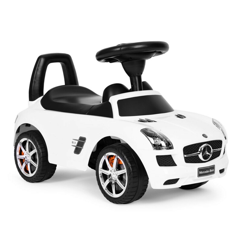
Masinuta Ride-On Pentru Copii, Mercedes SLS AMG, Cu Melodii Si Claxon, Spatar De Protectie, Volan Multimedia, Alba
204,00 lei
Brand: MULTISTORE Vezi oferta pe babyneeds.ro
Evoluție preț
Recenzii
Nu există recenzii până acum.