.bd-grid { display: grid; display: grid; grid-template-columns: repeat(3, minmax(0, 1fr)); row-gap: 50px; column-gap: 50px; justify-items: center; text-align: center; } @media screen and (max-width: 600px) { .bd-grid { display: grid; grid-template-columns: repeat(1, minmax(0, 1fr)); } } .bd-grid-s { display: grid; display: grid; grid-template-columns: repeat(2, minmax(0, 1fr)); row-gap: 50px; column-gap: 50px; justify-items: center; text-align: center; align-items: center; } @media screen and (max-width: 600px) { .bd-grid-s { display: grid; grid-template-columns: repeat(1, minmax(0, 1fr)); } } MASINUTA RIDE-ON CU MANER Constructie sigura, stabila si durabila Posibilitate de adaptare a ride-on-ului la varsta Un maner pentru a ghida vehiculul Volan cu claxon Bariere de siguranta pliabile Spatiu de depozitare sub scaun Suport pentru picioare detasabil Element anti-rasturnare 3IN1 – CRESTE ODATA CU COPILUL Datorita constructiei speciale, masinuta poate fi adaptata varstei copilului. Trei variante vor permite atat copiilor mici, cat si celor mai mari, mai independenti, sa se distreze. plimbare cu bariere care protejeaza impotriva caderii folosirea manerului pentru a fi condusa de un parinte masinuta cu conducere autonoma Toate elementele pot fi detasate, in funct ie de varsta copilului. Datorita acestei functionalitati, jucaria „creste odata cu copilul tau”. Pentru copiii mai mici, este de preferat sa atasati balustradele si suporturile pentru picioare care protejeaza impotriva caderii. Daca picioarele copilului ajung la pamant, puteti scoate balustradele si suportul pentru picioare si sa-l lasati sa calatoreasca liber. BLOCARE IMPOTRIVA CADERII Datorita unui element special montat in spatele ruloului, copilul este pe deplin in siguranta , impiedica rasturnarea vehiculului; in situatii periculoase, blocajul se sprijina pe sol si stabilizeaza vehiculul. SUPORT PENTRU PICIOARE Daca inaltimea copilului nu ii permite sa se impinga, instalati suporturi pentru picioare. Copilul va putea sa-si sprijine picioarele confortabil pe ele , astfel incat se va simti i n siguranta in timpul deplasarii. MANER PENTRU GHIDARE Datorita acestuia, puteti controla pe deplin viteza si traseul vehiculului . In functie de nevoile dvs., manerul poate fi indepartat pentru a va oferi o plimbare clasica pe care copiii mai mari o iubesc. .bd-grid { display: grid; display: grid; grid-template-columns: repeat(3, minmax(0, 1fr)); row-gap: 50px; column-gap: 50px; justify-items: center; text-align: center; } @media screen and (max-width: 600px) { .bd-grid { display: grid; grid-template-columns: repeat(1, minmax(0, 1fr)); } } .bd-grid-s { display: grid; display: grid; grid-template-columns: repeat(2, minmax(0, 1fr)); row-gap: 50px; column-gap: 50px; justify-items: center; text-align: center; align-items: center; } @media screen and (max-width: 600px) { .bd-grid-s { display: grid; grid-template-columns: repeat(1, minmax(0, 1fr)); } } .bd-grid { display: grid; display: grid; grid-template-columns: repeat(3, minmax(0, 1fr)); row-gap: 50px; column-gap: 50px; justify-items: center; text-align: center; } @media screen and (max-width: 600px) { .bd-grid { display: grid; grid-template-columns: repeat(1, minmax(0, 1fr)); } } .bd-grid-s { display: grid; display: grid; grid-template-columns: repeat(2, minmax(0, 1fr)); row-gap: 50px; column-gap: 50px; justify-items: center; text-align: center; align-items: center; } @media screen and (max-width: 600px) { .bd-grid-s { display: grid; grid-template-columns: repeat(1, minmax(0, 1fr)); } } .bd-grid { display: grid; display: grid; grid-template-columns: repeat(3, minmax(0, 1fr)); row-gap: 50px; column-gap: 50px; justify-items: center; text-align: center; } @media screen and (max-width: 600px) { .bd-grid { display: grid; grid-template-columns: repeat(1, minmax(0, 1fr)); } } .bd-grid-s { display: grid; display: grid; grid-template-columns: repeat(2, minmax(0, 1fr)); row-gap: 50px; column-gap: 50px; justify-items: center; text-align: center; align-items: center; } @media screen and (max-width: 600px) { .bd-grid-s { display: grid; grid-template-columns: repeat(1, minmax(0, 1fr)); } } .bd-grid { display: grid; display: grid; grid-template-columns: repeat(3, minmax(0, 1fr)); row-gap: 50px; column-gap: 50px; justify-items: center; text-align: center; } @media screen and (max-width: 600px) { .bd-grid { display: grid; grid-template-columns: repeat(1, minmax(0, 1fr)); } } .bd-grid-s { display: grid; display: grid; grid-template-columns: repeat(2, minmax(0, 1fr)); row-gap: 50px; column-gap: 50px; justify-items: center; text-align: center; align-items: center; } @media screen and (max-width: 600px) { .bd-grid-s { display: grid; grid-template-columns: repeat(1, minmax(0, 1fr)); } } .bd-grid { display: grid; display: grid; grid-template-columns: repeat(3, minmax(0, 1fr)); row-gap: 50px; column-gap: 50px; justify-items: center; text-align: center; } @media screen and (max-width: 600px) { .bd-grid { display: grid; grid-template-columns: repeat(1, minmax(0, 1fr)); } } .bd-grid-s { display: grid; display: grid; grid-template-columns: repeat(2, minmax(0, 1fr)); row-gap: 50px; column-gap: 50px; justify-items: center; text-align: center; align-items: center; } @media screen and (max-width: 600px) { .bd-grid-s { display: grid; grid-template-columns: repeat(1, minmax(0, 1fr)); } } .bd-grid { display: grid; display: grid; grid-template-columns: repeat(3, minmax(0, 1fr)); row-gap: 50px; column-gap: 50px; justify-items: center; text-align: center; } @media screen and (max-width: 600px) { .bd-grid { display: grid; grid-template-columns: repeat(1, minmax(0, 1fr)); } } .bd-grid-s { display: grid; display: grid; grid-template-columns: repeat(2, minmax(0, 1fr)); row-gap: 50px; column-gap: 50px; justify-items: center; text-align: center; align-items: center; } @media screen and (max-width: 600px) { .bd-grid-s { display: grid; grid-template-columns: repeat(1, minmax(0, 1fr)); } } .bd-grid { display: grid; display: grid; grid-template-columns: repeat(3, minmax(0, 1fr)); row-gap: 50px; column-gap: 50px; justify-items: center; text-align: center; } @media screen and (max-width: 600px) { .bd-grid { display: grid; grid-template-columns: repeat(1, minmax(0, 1fr)); } } .bd-grid-s { display: grid; display: grid; grid-template-columns: repeat(2, minmax(0, 1fr)); row-gap: 50px; column-gap: 50px; justify-items: center; text-align: center; align-items: center; } @media screen and (max-width: 600px) { .bd-grid-s { display: grid; grid-template-columns: repeat(1, minmax(0, 1fr)); } } .bd-grid { display: grid; display: grid; grid-template-columns: repeat(3, minmax(0, 1fr)); row-gap: 50px; column-gap: 50px; justify-items: center; text-align: center; } @media screen and (max-width: 600px) { .bd-grid { display: grid; grid-template-columns: repeat(1, minmax(0, 1fr)); } } .bd-grid-s { display: grid; display: grid; grid-template-columns: repeat(2, minmax(0, 1fr)); row-gap: 50px; column-gap: 50px; justify-items: center; text-align: center; align-items: center; } @media screen and (max-width: 600px) { .bd-grid-s { display: grid; grid-template-columns: repeat(1, minmax(0, 1fr)); } } .bd-grid { display: grid; display: grid; grid-template-columns: repeat(3, minmax(0, 1fr)); row-gap: 50px; column-gap: 50px; justify-items: center; text-align: center; } @media screen and (max-width: 600px) { .bd-grid { display: grid; grid-template-columns: repeat(1, minmax(0, 1fr)); } } .bd-grid-s { display: grid; display: grid; grid-template-columns: repeat(2, minmax(0, 1fr)); row-gap: 50px; column-gap: 50px; justify-items: center; text-align: center; align-items: center; } @media screen and (max-width: 600px) { .bd-grid-s { display: grid; grid-template-columns: repeat(1, minmax(0, 1fr)); } } .bd-grid { display: grid; display: grid; grid-template-columns: repeat(3, minmax(0, 1fr)); row-gap: 50px; column-gap: 50px; justify-items: center; text-align: center; } @media screen and (max-width: 600px) { .bd-grid { display: grid; grid-template-columns: repeat(1, minmax(0, 1fr)); } } .bd-grid-s { display: grid; display: grid; grid-template-columns: repeat(2, minmax(0, 1fr)); row-gap: 50px; column-gap: 50px; justify-items: center; text-align: center; align-items: center; } @media screen and (max-width: 600px) { .bd-grid-s { display: grid; grid-template-columns: repeat(1, minmax(0, 1fr)); } } .bd-grid { display: grid; display: grid; grid-template-columns: repeat(3, minmax(0, 1fr)); row-gap: 50px; column-gap: 50px; justify-items: center; text-align: center; } @media screen and (max-width: 600px) { .bd-grid { display: grid; grid-template-columns: repeat(1, minmax(0, 1fr)); } } .bd-grid-s { display: grid; display: grid; grid-template-columns: repeat(2, minmax(0, 1fr)); row-gap: 50px; column-gap: 50px; justify-items: center; text-align: center; align-items: center; } @media screen and (max-width: 600px) { .bd-grid-s { display: grid; grid-template-columns: repeat(1, minmax(0, 1fr)); } } .bd-grid { display: grid; display: grid; grid-template-columns: repeat(3, minmax(0, 1fr)); row-gap: 50px; column-gap: 50px; justify-items: center; text-align: center; } @media screen and (max-width: 600px) { .bd-grid { display: grid; grid-template-columns: repeat(1, minmax(0, 1fr)); } } .bd-grid-s { display: grid; display: grid; grid-template-columns: repeat(2, minmax(0, 1fr)); row-gap: 50px; column-gap: 50px; justify-items: center; text-align: center; align-items: center; } @media screen and (max-width: 600px) { .bd-grid-s { display: grid; grid-template-columns: repeat(1, minmax(0, 1fr)); } } .bd-grid { display: grid; display: grid; grid-template-columns: repeat(3, minmax(0, 1fr)); row-gap: 50px; column-gap: 50px; justify-items: center; text-align: center; } @media screen and (max-width: 600px) { .bd-grid { display: grid; grid-template-columns: repeat(1, minmax(0, 1fr)); } } .bd-grid-s { display: grid; display: grid; grid-template-columns: repeat(2, minmax(0, 1fr)); row-gap: 50px; column-gap: 50px; justify-items: center; text-align: center; align-items: center; } @media screen and (max-width: 600px) { .bd-grid-s { display: grid; grid-template-columns: repeat(1, minmax(0, 1fr)); } } .bd-grid { display: grid; display: grid; grid-template-columns: repeat(3, minmax(0, 1fr)); row-gap: 50px; column-gap: 50px; justify-items: center; text-align: center; } @media screen and (max-width: 600px) { .bd-grid { display: grid; grid-template-columns: repeat(1, minmax(0, 1fr)); } } .bd-grid-s { display: grid; display: grid; grid-template-columns: repeat(2, minmax(0, 1fr)); row-gap: 50px; column-gap: 50px; justify-items: center; text-align: center; align-items: center; } @media screen and (max-width: 600px) { .bd-grid-s { display: grid; grid-template-columns: repeat(1, minmax(0, 1fr)); } } .bd-grid { display: grid; display: grid; grid-template-columns: repeat(3, minmax(0, 1fr)); row-gap: 50px; column-gap: 50px; justify-items: center; text-align: center; } @media screen and (max-width: 600px) { .bd-grid { display: grid; grid-template-columns: repeat(1, minmax(0, 1fr)); } } .bd-grid-s { display: grid; display: grid; grid-template-columns: repeat(2, minmax(0, 1fr)); row-gap: 50px; column-gap: 50px; justify-items: center; text-align: center; align-items: center; } @media screen and (max-width: 600px) { .bd-grid-s { display: grid; grid-template-columns: repeat(1, minmax(0, 1fr)); } } .bd-grid { display: grid; display: grid; grid-template-columns: repeat(3, minmax(0, 1fr)); row-gap: 50px; column-gap: 50px; justify-items: center; text-align: center; } @media screen and (max-width: 600px) { .bd-grid { display: grid; grid-template-columns: repeat(1, minmax(0, 1fr)); } } .bd-grid-s { display: grid; display: grid; grid-template-columns: repeat(2, minmax(0, 1fr)); row-gap: 50px; column-gap: 50px; justify-items: center; text-align: center; align-items: center; } @media screen and (max-width: 600px) { .bd-grid-s { display: grid; grid-template-columns: repeat(1, minmax(0, 1fr)); } } .bd-grid { display: grid; display: grid; grid-template-columns: repeat(3, minmax(0, 1fr)); row-gap: 50px; column-gap: 50px; justify-items: center; text-align: center; } @media screen and (max-width: 600px) { .bd-grid { display: grid; grid-template-columns: repeat(1, minmax(0, 1fr)); } } .bd-grid-s { display: grid; display: grid; grid-template-columns: repeat(2, minmax(0, 1fr)); row-gap: 50px; column-gap: 50px; justify-items: center; text-align: center; align-items: center; } @media screen and (max-width: 600px) { .bd-grid-s { display: grid; grid-template-columns: repeat(1, minmax(0, 1fr)); } } .bd-grid { display: grid; display: grid; grid-template-columns: repeat(3, minmax(0, 1fr)); row-gap: 50px; column-gap: 50px; justify-items: center; text-align: center; } @media screen and (max-width: 600px) { .bd-grid { display: grid; grid-template-columns: repeat(1, minmax(0, 1fr)); } } .bd-grid-s { display: grid; display: grid; grid-template-columns: repeat(2, minmax(0, 1fr)); row-gap: 50px; column-gap: 50px; justify-items: center; text-align: center; align-items: center; } @media screen and (max-width: 600px) { .bd-grid-s { display: grid; grid-template-columns: repeat(1, minmax(0, 1fr)); } } .bd-grid { display: grid; display: grid; grid-template-columns: repeat(3, minmax(0, 1fr)); row-gap: 50px; column-gap: 50px; justify-items: center; text-align: center; } @media screen and (max-width: 600px) { .bd-grid { display: grid; grid-template-columns: repeat(1, minmax(0, 1fr)); } } .bd-grid-s { display: grid; display: grid; grid-template-columns: repeat(2, minmax(0, 1fr)); row-gap: 50px; column-gap: 50px; justify-items: center; text-align: center; align-items: center; } @media screen and (max-width: 600px) { .bd-grid-s { display: grid; grid-template-columns: repeat(1, minmax(0, 1fr)); } } .bd-grid { display: grid; display: grid; grid-template-columns: repeat(3, minmax(0, 1fr)); row-gap: 50px; column-gap: 50px; justify-items: center; text-align: center; } @media screen and (max-width: 600px) { .bd-grid { display: grid; grid-template-columns: repeat(1, minmax(0, 1fr)); } } .bd-grid-s { display: grid; display: grid; grid-template-columns: repeat(2, minmax(0, 1fr)); row-gap: 50px; column-gap: 50px; justify-items: center; text-align: center; align-items: center; } @media screen and (max-width: 600px) { .bd-grid-s { display: grid; grid-template-columns: repeat(1, minmax(0, 1fr)); } } .bd-grid { display: grid; display: grid; grid-template-columns: repeat(3, minmax(0, 1fr)); row-gap: 50px; column-gap: 50px; justify-items: center; text-align: center; } @media screen and (max-width: 600px) { .bd-grid { display: grid; grid-template-columns: repeat(1, minmax(0, 1fr)); } } .bd-grid-s { display: grid; display: grid; grid-template-columns: repeat(2, minmax(0, 1fr)); row-gap: 50px; column-gap: 50px; justify-items: center; text-align: center; align-items: center; } @media screen and (max-width: 600px) { .bd-grid-s { display: grid; grid-template-columns: repeat(1, minmax(0, 1fr)); } } .bd-grid { display: grid; display: grid; grid-template-columns: repeat(3, minmax(0, 1fr)); row-gap: 50px; column-gap: 50px; justify-items: center; text-align: center; } @media screen and (max-width: 600px) { .bd-grid { display: grid; grid-template-columns: repeat(1, minmax(0, 1fr)); } } .bd-grid-s { display: grid; display: grid; grid-template-columns: repeat(2, minmax(0, 1fr)); row-gap: 50px; column-gap: 50px; justify-items: center; text-align: center; align-items: center; } @media screen and (max-width: 600px) { .bd-grid-s { display: grid; grid-template-columns: repeat(1, minmax(0, 1fr)); } } .bd-grid { display: grid; display: grid; grid-template-columns: repeat(3, minmax(0, 1fr)); row-gap: 50px; column-gap: 50px; justify-items: center; text-align: center; } @media screen and (max-width: 600px) { .bd-grid { display: grid; grid-template-columns: repeat(1, minmax(0, 1fr)); } } .bd-grid-s { display: grid; display: grid; grid-template-columns: repeat(2, minmax(0, 1fr)); row-gap: 50px; column-gap: 50px; justify-items: center; text-align: center; align-items: center; } @media screen and (max-width: 600px) { .bd-grid-s { display: grid; grid-template-columns: repeat(1, minmax(0, 1fr)); } } .bd-grid { display: grid; display: grid; grid-template-columns: repeat(3, minmax(0, 1fr)); row-gap: 50px; column-gap: 50px; justify-items: center; text-align: center; } @media screen and (max-width: 600px) { .bd-grid { display: grid; grid-template-columns: repeat(1, minmax(0, 1fr)); } } .bd-grid-s { display: grid; display: grid; grid-template-columns: repeat(2, minmax(0, 1fr)); row-gap: 50px; column-gap: 50px; justify-items: center; text-align: center; align-items: center; } @media screen and (max-width: 600px) { .bd-grid-s { display: grid; grid-template-columns: repeat(1, minmax(0, 1fr)); } } .bd-grid { display: grid; display: grid; grid-template-columns: repeat(3, minmax(0, 1fr)); row-gap: 50px; column-gap: 50px; justify-items: center; text-align: center; } @media screen and (max-width: 600px) { .bd-grid { display: grid; grid-template-columns: repeat(1, minmax(0, 1fr)); } } .bd-grid-s { display: grid; display: grid; grid-template-columns: repeat(2, minmax(0, 1fr)); row-gap: 50px; column-gap: 50px; justify-items: center; text-align: center; align-items: center; } @media screen and (max-width: 600px) { .bd-grid-s { display: grid; grid-template-columns: repeat(1, minmax(0, 1fr)); } } .bd-grid { display: grid; display: grid; grid-template-columns: repeat(3, minmax(0, 1fr)); row-gap: 50px; column-gap: 50px; justify-items: center; text-align: center; } @media screen and (max-width: 600px) { .bd-grid { display: grid; grid-template-columns: repeat(1, minmax(0, 1fr)); } } .bd-grid-s { display: grid; display: grid; grid-template-columns: repeat(2, minmax(0, 1fr)); row-gap: 50px; column-gap: 50px; justify-items: center; text-align: center; align-items: center; } @media screen and (max-width: 600px) { .bd-grid-s { display: grid; grid-template-columns: repeat(1, minmax(0, 1fr)); } } .bd-grid { display: grid; display: grid; grid-template-columns: repeat(3, minmax(0, 1fr)); row-gap: 50px; column-gap: 50px; justify-items: center; text-align: center; } @media screen and (max-width: 600px) { .bd-grid { display: grid; grid-template-columns: repeat(1, minmax(0, 1fr)); } } .bd-grid-s { display: grid; display: grid; grid-template-columns: repeat(2, minmax(0, 1fr)); row-gap: 50px; column-gap: 50px; justify-items: center; text-align: center; align-items: center; } @media screen and (max-width: 600px) { .bd-grid-s { display: grid; grid-template-columns: repeat(1, minmax(0, 1fr)); } } .bd-grid { display: grid; display: grid; grid-template-columns: repeat(3, minmax(0, 1fr)); row-gap: 50px; column-gap: 50px; justify-items: center; text-align: center; } @media screen and (max-width: 600px) { .bd-grid { display: grid; grid-template-columns: repeat(1, minmax(0, 1fr)); } } .bd-grid-s { display: grid; display: grid; grid-template-columns: repeat(2, minmax(0, 1fr)); row-gap: 50px; column-gap: 50px; justify-items: center; text-align: center; align-items: center; } @media screen and (max-width: 600px) { .bd-grid-s { display: grid; grid-template-columns: repeat(1, minmax(0, 1fr)); } } .bd-grid { display: grid; display: grid; grid-template-columns: repeat(3, minmax(0, 1fr)); row-gap: 50px; column-gap: 50px; justify-items: center; text-align: center; } @media screen and (max-width: 600px) { .bd-grid { display: grid; grid-template-columns: repeat(1, minmax(0, 1fr)); } } .bd-grid-s { display: grid; display: grid; grid-template-columns: repeat(2, minmax(0, 1fr)); row-gap: 50px; column-gap: 50px; justify-items: center; text-align: center; align-items: center; } @media screen and (max-width: 600px) { .bd-grid-s { display: grid; grid-template-columns: repeat(1, minmax(0, 1fr)); } } .bd-grid { display: grid; display: grid; grid-template-columns: repeat(3, minmax(0, 1fr)); row-gap: 50px; column-gap: 50px; justify-items: center; text-align: center; } @media screen and (max-width: 600px) { .bd-grid { display: grid; grid-template-columns: repeat(1, minmax(0, 1fr)); } } .bd-grid-s { display: grid; display: grid; grid-template-columns: repeat(2, minmax(0, 1fr)); row-gap: 50px; column-gap: 50px; justify-items: center; text-align: center; align-items: center; } @media screen and (max-width: 600px) { .bd-grid-s { display: grid; grid-template-columns: repeat(1, minmax(0, 1fr)); } } .bd-grid { display: grid; display: grid; grid-template-columns: repeat(3, minmax(0, 1fr)); row-gap: 50px; column-gap: 50px; justify-items: center; text-align: center; } @media screen and (max-width: 600px) { .bd-grid { display: grid; grid-template-columns: repeat(1, minmax(0, 1fr)); } } .bd-grid-s { display: grid; display: grid; grid-template-columns: repeat(2, minmax(0, 1fr)); row-gap: 50px; column-gap: 50px; justify-items: center; text-align: center; align-items: center; } @media screen and (max-width: 600px) { .bd-grid-s { display: grid; grid-template-columns: repeat(1, minmax(0, 1fr)); } } .bd-grid { display: grid; display: grid; grid-template-columns: repeat(3, minmax(0, 1fr)); row-gap: 50px; column-gap: 50px; justify-items: center; text-align: center; } @media screen and (max-width: 600px) { .bd-grid { display: grid; grid-template-columns: repeat(1, minmax(0, 1fr)); } } .bd-grid-s { display: grid; display: grid; grid-template-columns: repeat(2, minmax(0, 1fr)); row-gap: 50px; column-gap: 50px; justify-items: center; text-align: center; align-items: center; } @media screen and (max-width: 600px) { .bd-grid-s { display: grid; grid-template-columns: repeat(1, minmax(0, 1fr)); } } .bd-grid { display: grid; display: grid; grid-template-columns: repeat(3, minmax(0, 1fr)); row-gap: 50px; column-gap: 50px; justify-items: center; text-align: center; } @media screen and (max-width: 600px) { .bd-grid { display: grid; grid-template-columns: repeat(1, minmax(0, 1fr)); } } .bd-grid-s { display: grid; display: grid; grid-template-columns: repeat(2, minmax(0, 1fr)); row-gap: 50px; column-gap: 50px; justify-items: center; text-align: center; align-items: center; } @media screen and (max-width: 600px) { .bd-grid-s { display: grid; grid-template-columns: repeat(1, minmax(0, 1fr)); } } .bd-grid { display: grid; display: grid; grid-template-columns: repeat(3, minmax(0, 1fr)); row-gap: 50px; column-gap: 50px; justify-items: center; text-align: center; } @media screen and (max-width: 600px) { .bd-grid { display: grid; grid-template-columns: repeat(1, minmax(0, 1fr)); } } .bd-grid-s { display: grid; display: grid; grid-template-columns: repeat(2, minmax(0, 1fr)); row-gap: 50px; column-gap: 50px; justify-items: center; text-align: center; align-items: center; } @media screen and (max-width: 600px) { .bd-grid-s { display: grid; grid-template-columns: repeat(1, minmax(0, 1fr)); } } .bd-grid { display: grid; display: grid; grid-template-columns: repeat(3, minmax(0, 1fr)); row-gap: 50px; column-gap: 50px; justify-items: center; text-align: center; } @media screen and (max-width: 600px) { .bd-grid { display: grid; grid-template-columns: repeat(1, minmax(0, 1fr)); } } .bd-grid-s { display: grid; display: grid; grid-template-columns: repeat(2, minmax(0, 1fr)); row-gap: 50px; column-gap: 50px; justify-items: center; text-align: center; align-items: center; } @media screen and (max-width: 600px) { .bd-grid-s { display: grid; grid-template-columns: repeat(1, minmax(0, 1fr)); } } .bd-grid { display: grid; display: grid; grid-template-columns: repeat(3, minmax(0, 1fr)); row-gap: 50px; column-gap: 50px; justify-items: center; text-align: center; } @media screen and (max-width: 600px) { .bd-grid { display: grid; grid-template-columns: repeat(1, minmax(0, 1fr)); } } .bd-grid-s { display: grid; display: grid; grid-template-columns: repeat(2, minmax(0, 1fr)); row-gap: 50px; column-gap: 50px; justify-items: center; text-align: center; align-items: center; } @media screen and (max-width: 600px) { .bd-grid-s { display: grid; grid-template-columns: repeat(1, minmax(0, 1fr)); } } .bd-grid { display: grid; display: grid; grid-template-columns: repeat(3, minmax(0, 1fr)); row-gap: 50px; column-gap: 50px; justify-items: center; text-align: center; } @media screen and (max-width: 600px) { .bd-grid { display: grid; grid-template-columns: repeat(1, minmax(0, 1fr)); } } .bd-grid-s { display: grid; display: grid; grid-template-columns: repeat(2, minmax(0, 1fr)); row-gap: 50px; column-gap: 50px; justify-items: center; text-align: center; align-items: center; } @media screen and (max-width: 600px) { .bd-grid-s { display: grid; grid-template-columns: repeat(1, minmax(0, 1fr)); } } .bd-grid { display: grid; display: grid; grid-template-columns: repeat(3, minmax(0, 1fr)); row-gap: 50px; column-gap: 50px; justify-items: center; text-align: center; } @media screen and (max-width: 600px) { .bd-grid { display: grid; grid-template-columns: repeat(1, minmax(0, 1fr)); } } .bd-grid-s { display: grid; display: grid; grid-template-columns: repeat(2, minmax(0, 1fr)); row-gap: 50px; column-gap: 50px; justify-items: center; text-align: center; align-items: center; } @media screen and (max-width: 600px) { .bd-grid-s { display: grid; grid-template-columns: repeat(1, minmax(0, 1fr)); } } .bd-grid { display: grid; display: grid; grid-template-columns: repeat(3, minmax(0, 1fr)); row-gap: 50px; column-gap: 50px; justify-items: center; text-align: center; } @media screen and (max-width: 600px) { .bd-grid { display: grid; grid-template-columns: repeat(1, minmax(0, 1fr)); } } .bd-grid-s { display: grid; display: grid; grid-template-columns: repeat(2, minmax(0, 1fr)); row-gap: 50px; column-gap: 50px; justify-items: center; text-align: center; align-items: center; } @media screen and (max-width: 600px) { .bd-grid-s { display: grid; grid-template-columns: repeat(1, minmax(0, 1fr)); } } .bd-grid { display: grid; display: grid; grid-template-columns: repeat(3, minmax(0, 1fr)); row-gap: 50px; column-gap: 50px; justify-items: center; text-align: center; } @media screen and (max-width: 600px) { .bd-grid { display: grid; grid-template-columns: repeat(1, minmax(0, 1fr)); } } .bd-grid-s { display: grid; display: grid; grid-template-columns: repeat(2, minmax(0, 1fr)); row-gap: 50px; column-gap: 50px; justify-items: center; text-align: center; align-items: center; } @media screen and (max-width: 600px) { .bd-grid-s { display: grid; grid-template-columns: repeat(1, minmax(0, 1fr)); } } .bd-grid { display: grid; display: grid; grid-template-columns: repeat(3, minmax(0, 1fr)); row-gap: 50px; column-gap: 50px; justify-items: center; text-align: center; } @media screen and (max-width: 600px) { .bd-grid { display: grid; grid-template-columns: repeat(1, minmax(0, 1fr)); } } .bd-grid-s { display: grid; display: grid; grid-template-columns: repeat(2, minmax(0, 1fr)); row-gap: 50px; column-gap: 50px; justify-items: center; text-align: center; align-items: center; } @media screen and (max-width: 600px) { .bd-grid-s { display: grid; grid-template-columns: repeat(1, minmax(0, 1fr)); } } .bd-grid { display: grid; display: grid; grid-template-columns: repeat(3, minmax(0, 1fr)); row-gap: 50px; column-gap: 50px; justify-items: center; text-align: center; } @media screen and (max-width: 600px) { .bd-grid { display: grid; grid-template-columns: repeat(1, minmax(0, 1fr)); } } .bd-grid-s { display: grid; display: grid; grid-template-columns: repeat(2, minmax(0, 1fr)); row-gap: 50px; column-gap: 50px; justify-items: center; text-align: center; align-items: center; } @media screen and (max-width: 600px) { .bd-grid-s { display: grid; grid-template-columns: repeat(1, minmax(0, 1fr)); } } .bd-grid { display: grid; display: grid; grid-template-columns: repeat(3, minmax(0, 1fr)); row-gap: 50px; column-gap: 50px; justify-items: center; text-align: center; } @media screen and (max-width: 600px) { .bd-grid { display: grid; grid-template-columns: repeat(1, minmax(0, 1fr)); } } .bd-grid-s { display: grid; display: grid; grid-template-columns: repeat(2, minmax(0, 1fr)); row-gap: 50px; column-gap: 50px; justify-items: center; text-align: center; align-items: center; } @media screen and (max-width: 600px) { .bd-grid-s { display: grid; grid-template-columns: repeat(1, minmax(0, 1fr)); } } SPATIU DE DPOZITARE FUNCTIONAL Sub scaun exista un compartiment de depozitare incapator care va gazdui jucariile preferate si comorile gasite in timpul plimbarilor. Datorita acestuia, micul tau sofer va avea mereu la indemana toate accesoriile necesare pentru a se juca. SPECIFICATII TEHNICE Vârsta copilului : 3 ani+ Lungime : 60 cm Latime: 43 cm Inaltime : 85 cm Sarcina admisa: 25 kg Dimensiuni pachet: 62 x 35 x 30 cm Cod produs: 381-PINK .bd-grid { display: grid; display: grid; grid-template-columns: repeat(3, minmax(0, 1fr)); row-gap: 50px; column-gap: 50px; justify-items: center; text-align: center; } @media screen and (max-width: 600px) { .bd-grid { display: grid; grid-template-columns: repeat(1, minmax(0, 1fr)); } } .bd-grid-s { display: grid; display: grid; grid-template-columns: repeat(2, minmax(0, 1fr)); row-gap: 50px; column-gap: 50px; justify-items: center; text-align: center; align-items: center; } @media screen and (max-width: 600px) { .bd-grid-s { display: grid; grid-template-columns: repeat(1, minmax(0, 1fr)); } } .bd-grid { display: grid; display: grid; grid-template-columns: repeat(3, minmax(0, 1fr)); row-gap: 50px; column-gap: 50px; justify-items: center; text-align: center; } @media screen and (max-width: 600px) { .bd-grid { display: grid; grid-template-columns: repeat(1, minmax(0, 1fr)); } } .bd-grid-s { display: grid; display: grid; grid-template-columns: repeat(2, minmax(0, 1fr)); row-gap: 50px; column-gap: 50px; justify-items: center; text-align: center; align-items: center; } @media screen and (max-width: 600px) { .bd-grid-s { display: grid; grid-template-columns: repeat(1, minmax(0, 1fr)); } } .bd-grid { display: grid; display: grid; grid-template-columns: repeat(3, minmax(0, 1fr)); row-gap: 50px; column-gap: 50px; justify-items: center; text-align: center; } @media screen and (max-width: 600px) { .bd-grid { display: grid; grid-template-columns: repeat(1, minmax(0, 1fr)); } } .bd-grid-s { display: grid; display: grid; grid-template-columns: repeat(2, minmax(0, 1fr)); row-gap: 50px; column-gap: 50px; justify-items: center; text-align: center; align-items: center; } @media screen and (max-width: 600px) { .bd-grid-s { display: grid; grid-template-columns: repeat(1, minmax(0, 1fr)); } } .bd-grid { display: grid; display: grid; grid-template-columns: repeat(3, minmax(0, 1fr)); row-gap: 50px; column-gap: 50px; justify-items: center; text-align: center; } @media screen and (max-width: 600px) { .bd-grid { display: grid; grid-template-columns: repeat(1, minmax(0, 1fr)); } } .bd-grid-s { display: grid; display: grid; grid-template-columns: repeat(2, minmax(0, 1fr)); row-gap: 50px; column-gap: 50px; justify-items: center; text-align: center; align-items: center; } @media screen and (max-width: 600px) { .bd-grid-s { display: grid; grid-template-columns: repeat(1, minmax(0, 1fr)); } } .bd-grid { display: grid; display: grid; grid-template-columns: repeat(3, minmax(0, 1fr)); row-gap: 50px; column-gap: 50px; justify-items: center; text-align: center; } @media screen and (max-width: 600px) { .bd-grid { display: grid; grid-template-columns: repeat(1, minmax(0, 1fr)); } } .bd-grid-s { display: grid; display: grid; grid-template-columns: repeat(2, minmax(0, 1fr)); row-gap: 50px; column-gap: 50px; justify-items: center; text-align: center; align-items: center; } @media screen and (max-width: 600px) { .bd-grid-s { display: grid; grid-template-columns: repeat(1, minmax(0, 1fr)); } } .bd-grid { display: grid; display: grid; grid-template-columns: repeat(3, minmax(0, 1fr)); row-gap: 50px; column-gap: 50px; justify-items: center; text-align: center; } @media screen and (max-width: 600px) { .bd-grid { display: grid; grid-template-columns: repeat(1, minmax(0, 1fr)); } } .bd-grid-s { display: grid; display: grid; grid-template-columns: repeat(2, minmax(0, 1fr)); row-gap: 50px; column-gap: 50px; justify-items: center; text-align: center; align-items: center; } @media screen and (max-width: 600px) { .bd-grid-s { display: grid; grid-template-columns: repeat(1, minmax(0, 1fr)); } } .bd-grid { display: grid; display: grid; grid-template-columns: repeat(3, minmax(0, 1fr)); row-gap: 50px; column-gap: 50px; justify-items: center; text-align: center; } @media screen and (max-width: 600px) { .bd-grid { display: grid; grid-template-columns: repeat(1, minmax(0, 1fr)); } } .bd-grid-s { display: grid; display: grid; grid-template-columns: repeat(2, minmax(0, 1fr)); row-gap: 50px; column-gap: 50px; justify-items: center; text-align: center; align-items: center; } @media screen and (max-width: 600px) { .bd-grid-s { display: grid; grid-template-columns: repeat(1, minmax(0, 1fr)); } } .bd-grid { display: grid; display: grid; grid-template-columns: repeat(3, minmax(0, 1fr)); row-gap: 50px; column-gap: 50px; justify-items: center; text-align: center; } @media screen and (max-width: 600px) { .bd-grid { display: grid; grid-template-columns: repeat(1, minmax(0, 1fr)); } } .bd-grid-s { display: grid; display: grid; grid-template-columns: repeat(2, minmax(0, 1fr)); row-gap: 50px; column-gap: 50px; justify-items: center; text-align: center; align-items: center; } @media screen and (max-width: 600px) { .bd-grid-s { display: grid; grid-template-columns: repeat(1, minmax(0, 1fr)); } } .bd-grid { display: grid; display: grid; grid-template-columns: repeat(3, minmax(0, 1fr)); row-gap: 50px; column-gap: 50px; justify-items: center; text-align: center; } @media screen and (max-width: 600px) { .bd-grid { display: grid; grid-template-columns: repeat(1, minmax(0, 1fr)); } } .bd-grid-s { display: grid; display: grid; grid-template-columns: repeat(2, minmax(0, 1fr)); row-gap: 50px; column-gap: 50px; justify-items: center; text-align: center; align-items: center; } @media screen and (max-width: 600px) { .bd-grid-s { display: grid; grid-template-columns: repeat(1, minmax(0, 1fr)); } } .bd-grid { display: grid; display: grid; grid-template-columns: repeat(3, minmax(0, 1fr)); row-gap: 50px; column-gap: 50px; justify-items: center; text-align: center; } @media screen and (max-width: 600px) { .bd-grid { display: grid; grid-template-columns: repeat(1, minmax(0, 1fr)); } } .bd-grid-s { display: grid; display: grid; grid-template-columns: repeat(2, minmax(0, 1fr)); row-gap: 50px; column-gap: 50px; justify-items: center; text-align: center; align-items: center; } @media screen and (max-width: 600px) { .bd-grid-s { display: grid; grid-template-columns: repeat(1, minmax(0, 1fr)); } } .bd-grid { display: grid; display: grid; grid-template-columns: repeat(3, minmax(0, 1fr)); row-gap: 50px; column-gap: 50px; justify-items: center; text-align: center; } @media screen and (max-width: 600px) { .bd-grid { display: grid; grid-template-columns: repeat(1, minmax(0, 1fr)); } } .bd-grid-s { display: grid; display: grid; grid-template-columns: repeat(2, minmax(0, 1fr)); row-gap: 50px; column-gap: 50px; justify-items: center; text-align: center; align-items: center; } @media screen and (max-width: 600px) { .bd-grid-s { display: grid; grid-template-columns: repeat(1, minmax(0, 1fr)); } } .bd-grid { display: grid; display: grid; grid-template-columns: repeat(3, minmax(0, 1fr)); row-gap: 50px; column-gap: 50px; justify-items: center; text-align: center; } @media screen and (max-width: 600px) { .bd-grid { display: grid; grid-template-columns: repeat(1, minmax(0, 1fr)); } } .bd-grid-s { display: grid; display: grid; grid-template-columns: repeat(2, minmax(0, 1fr)); row-gap: 50px; column-gap: 50px; justify-items: center; text-align: center; align-items: center; } @media screen and (max-width: 600px) { .bd-grid-s { display: grid; grid-template-columns: repeat(1, minmax(0, 1fr)); } } .bd-grid { display: grid; display: grid; grid-template-columns: repeat(3, minmax(0, 1fr)); row-gap: 50px; column-gap: 50px; justify-items: center; text-align: center; } @media screen and (max-width: 600px) { .bd-grid { display: grid; grid-template-columns: repeat(1, minmax(0, 1fr)); } } .bd-grid-s { display: grid; display: grid; grid-template-columns: repeat(2, minmax(0, 1fr)); row-gap: 50px; column-gap: 50px; justify-items: center; text-align: center; align-items: center; } @media screen and (max-width: 600px) { .bd-grid-s { display: grid; grid-template-columns: repeat(1, minmax(0, 1fr)); } } .bd-grid { display: grid; display: grid; grid-template-columns: repeat(3, minmax(0, 1fr)); row-gap: 50px; column-gap: 50px; justify-items: center; text-align: center; } @media screen and (max-width: 600px) { .bd-grid { display: grid; grid-template-columns: repeat(1, minmax(0, 1fr)); } } .bd-grid-s { display: grid; display: grid; grid-template-columns: repeat(2, minmax(0, 1fr)); row-gap: 50px; column-gap: 50px; justify-items: center; text-align: center; align-items: center; } @media screen and (max-width: 600px) { .bd-grid-s { display: grid; grid-template-columns: repeat(1, minmax(0, 1fr)); } } .bd-grid { display: grid; display: grid; grid-template-columns: repeat(3, minmax(0, 1fr)); row-gap: 50px; column-gap: 50px; justify-items: center; text-align: center; } @media screen and (max-width: 600px) { .bd-grid { display: grid; grid-template-columns: repeat(1, minmax(0, 1fr)); } } .bd-grid-s { display: grid; display: grid; grid-template-columns: repeat(2, minmax(0, 1fr)); row-gap: 50px; column-gap: 50px; justify-items: center; text-align: center; align-items: center; } @media screen and (max-width: 600px) { .bd-grid-s { display: grid; grid-template-columns: repeat(1, minmax(0, 1fr)); } } .bd-grid { display: grid; display: grid; grid-template-columns: repeat(3, minmax(0, 1fr)); row-gap: 50px; column-gap: 50px; justify-items: center; text-align: center; } @media screen and (max-width: 600px) { .bd-grid { display: grid; grid-template-columns: repeat(1, minmax(0, 1fr)); } } .bd-grid-s { display: grid; display: grid; grid-template-columns: repeat(2, minmax(0, 1fr)); row-gap: 50px; column-gap: 50px; justify-items: center; text-align: center; align-items: center; } @media screen and (max-width: 600px) { .bd-grid-s { display: grid; grid-template-columns: repeat(1, minmax(0, 1fr)); } } .bd-grid { display: grid; display: grid; grid-template-columns: repeat(3, minmax(0, 1fr)); row-gap: 50px; column-gap: 50px; justify-items: center; text-align: center; } @media screen and (max-width: 600px) { .bd-grid { display: grid; grid-template-columns: repeat(1, minmax(0, 1fr)); } } .bd-grid-s { display: grid; display: grid; grid-template-columns: repeat(2, minmax(0, 1fr)); row-gap: 50px; column-gap: 50px; justify-items: center; text-align: center; align-items: center; } @media screen and (max-width: 600px) { .bd-grid-s { display: grid; grid-template-columns: repeat(1, minmax(0, 1fr)); } } .bd-grid { display: grid; display: grid; grid-template-columns: repeat(3, minmax(0, 1fr)); row-gap: 50px; column-gap: 50px; justify-items: center; text-align: center; } @media screen and (max-width: 600px) { .bd-grid { display: grid; grid-template-columns: repeat(1, minmax(0, 1fr)); } } .bd-grid-s { display: grid; display: grid; grid-template-columns: repeat(2, minmax(0, 1fr)); row-gap: 50px; column-gap: 50px; justify-items: center; text-align: center; align-items: center; } @media screen and (max-width: 600px) { .bd-grid-s { display: grid; grid-template-columns: repeat(1, minmax(0, 1fr)); } } .bd-grid { display: grid; display: grid; grid-template-columns: repeat(3, minmax(0, 1fr)); row-gap: 50px; column-gap: 50px; justify-items: center; text-align: center; } @media screen and (max-width: 600px) { .bd-grid { display: grid; grid-template-columns: repeat(1, minmax(0, 1fr)); } } .bd-grid-s { display: grid; display: grid; grid-template-columns: repeat(2, minmax(0, 1fr)); row-gap: 50px; column-gap: 50px; justify-items: center; text-align: center; align-items: center; } @media screen and (max-width: 600px) { .bd-grid-s { display: grid; grid-template-columns: repeat(1, minmax(0, 1fr)); } } .bd-grid { display: grid; display: grid; grid-template-columns: repeat(3, minmax(0, 1fr)); row-gap: 50px; column-gap: 50px; justify-items: center; text-align: center; } @media screen and (max-width: 600px) { .bd-grid { display: grid; grid-template-columns: repeat(1, minmax(0, 1fr)); } } .bd-grid-s { display: grid; display: grid; grid-template-columns: repeat(2, minmax(0, 1fr)); row-gap: 50px; column-gap: 50px; justify-items: center; text-align: center; align-items: center; } @media screen and (max-width: 600px) { .bd-grid-s { display: grid; grid-template-columns: repeat(1, minmax(0, 1fr)); } } .bd-grid { display: grid; display: grid; grid-template-columns: repeat(3, minmax(0, 1fr)); row-gap: 50px; column-gap: 50px; justify-items: center; text-align: center; } @media screen and (max-width: 600px) { .bd-grid { display: grid; grid-template-columns: repeat(1, minmax(0, 1fr)); } } .bd-grid-s { display: grid; display: grid; grid-template-columns: repeat(2, minmax(0, 1fr)); row-gap: 50px; column-gap: 50px; justify-items: center; text-align: center; align-items: center; } @media screen and (max-width: 600px) { .bd-grid-s { display: grid; grid-template-columns: repeat(1, minmax(0, 1fr)); } } .bd-grid { display: grid; display: grid; grid-template-columns: repeat(3, minmax(0, 1fr)); row-gap: 50px; column-gap: 50px; justify-items: center; text-align: center; } @media screen and (max-width: 600px) { .bd-grid { display: grid; grid-template-columns: repeat(1, minmax(0, 1fr)); } } .bd-grid-s { display: grid; display: grid; grid-template-columns: repeat(2, minmax(0, 1fr)); row-gap: 50px; column-gap: 50px; justify-items: center; text-align: center; align-items: center; } @media screen and (max-width: 600px) { .bd-grid-s { display: grid; grid-template-columns: repeat(1, minmax(0, 1fr)); } } .bd-grid { display: grid; display: grid; grid-template-columns: repeat(3, minmax(0, 1fr)); row-gap: 50px; column-gap: 50px; justify-items: center; text-align: center; } @media screen and (max-width: 600px) { .bd-grid { display: grid; grid-template-columns: repeat(1, minmax(0, 1fr)); } } .bd-grid-s { display: grid; display: grid; grid-template-columns: repeat(2, minmax(0, 1fr)); row-gap: 50px; column-gap: 50px; justify-items: center; text-align: center; align-items: center; } @media screen and (max-width: 600px) { .bd-grid-s { display: grid; grid-template-columns: repeat(1, minmax(0, 1fr)); } } .bd-grid { display: grid; display: grid; grid-template-columns: repeat(3, minmax(0, 1fr)); row-gap: 50px; column-gap: 50px; justify-items: center; text-align: center; } @media screen and (max-width: 600px) { .bd-grid { display: grid; grid-template-columns: repeat(1, minmax(0, 1fr)); } } .bd-grid-s { display: grid; display: grid; grid-template-columns: repeat(2, minmax(0, 1fr)); row-gap: 50px; column-gap: 50px; justify-items: center; text-align: center; align-items: center; } @media screen and (max-width: 600px) { .bd-grid-s { display: grid; grid-template-columns: repeat(1, minmax(0, 1fr)); } } .bd-grid { display: grid; display: grid; grid-template-columns: repeat(3, minmax(0, 1fr)); row-gap: 50px; column-gap: 50px; justify-items: center; text-align: center; } @media screen and (max-width: 600px) { .bd-grid { display: grid; grid-template-columns: repeat(1, minmax(0, 1fr)); } } .bd-grid-s { display: grid; display: grid; grid-template-columns: repeat(2, minmax(0, 1fr)); row-gap: 50px; column-gap: 50px; justify-items: center; text-align: center; align-items: center; } @media screen and (max-width: 600px) { .bd-grid-s { display: grid; grid-template-columns: repeat(1, minmax(0, 1fr)); } } .bd-grid { display: grid; display: grid; grid-template-columns: repeat(3, minmax(0, 1fr)); row-gap: 50px; column-gap: 50px; justify-items: center; text-align: center; } @media screen and (max-width: 600px) { .bd-grid { display: grid; grid-template-columns: repeat(1, minmax(0, 1fr)); } } .bd-grid-s { display: grid; display: grid; grid-template-columns: repeat(2, minmax(0, 1fr)); row-gap: 50px; column-gap: 50px; justify-items: center; text-align: center; align-items: center; } @media screen and (max-width: 600px) { .bd-grid-s { display: grid; grid-template-columns: repeat(1, minmax(0, 1fr)); } } .bd-grid { display: grid; display: grid; grid-template-columns: repeat(3, minmax(0, 1fr)); row-gap: 50px; column-gap: 50px; justify-items: center; text-align: center; } @media screen and (max-width: 600px) { .bd-grid { display: grid; grid-template-columns: repeat(1, minmax(0, 1fr)); } } .bd-grid-s { display: grid; display: grid; grid-template-columns: repeat(2, minmax(0, 1fr)); row-gap: 50px; column-gap: 50px; justify-items: center; text-align: center; align-items: center; } @media screen and (max-width: 600px) { .bd-grid-s { display: grid; grid-template-columns: repeat(1, minmax(0, 1fr)); } } .bd-grid { display: grid; display: grid; grid-template-columns: repeat(3, minmax(0, 1fr)); row-gap: 50px; column-gap: 50px; justify-items: center; text-align: center; } @media screen and (max-width: 600px) { .bd-grid { display: grid; grid-template-columns: repeat(1, minmax(0, 1fr)); } } .bd-grid-s { display: grid; display: grid; grid-template-columns: repeat(2, minmax(0, 1fr)); row-gap: 50px; column-gap: 50px; justify-items: center; text-align: center; align-items: center; } @media screen and (max-width: 600px) { .bd-grid-s { display: grid; grid-template-columns: repeat(1, minmax(0, 1fr)); } } .bd-grid { display: grid; display: grid; grid-template-columns: repeat(3, minmax(0, 1fr)); row-gap: 50px; column-gap: 50px; justify-items: center; text-align: center; } @media screen and (max-width: 600px) { .bd-grid { display: grid; grid-template-columns: repeat(1, minmax(0, 1fr)); } } .bd-grid-s { display: grid; display: grid; grid-template-columns: repeat(2, minmax(0, 1fr)); row-gap: 50px; column-gap: 50px; justify-items: center; text-align: center; align-items: center; } @media screen and (max-width: 600px) { .bd-grid-s { display: grid; grid-template-columns: repeat(1, minmax(0, 1fr)); } } .bd-grid { display: grid; display: grid; grid-template-columns: repeat(3, minmax(0, 1fr)); row-gap: 50px; column-gap: 50px; justify-items: center; text-align: center; } @media screen and (max-width: 600px) { .bd-grid { display: grid; grid-template-columns: repeat(1, minmax(0, 1fr)); } } .bd-grid-s { display: grid; display: grid; grid-template-columns: repeat(2, minmax(0, 1fr)); row-gap: 50px; column-gap: 50px; justify-items: center; text-align: center; align-items: center; } @media screen and (max-width: 600px) { .bd-grid-s { display: grid; grid-template-columns: repeat(1, minmax(0, 1fr)); } } .bd-grid { display: grid; display: grid; grid-template-columns: repeat(3, minmax(0, 1fr)); row-gap: 50px; column-gap: 50px; justify-items: center; text-align: center; } @media screen and (max-width: 600px) { .bd-grid { display: grid; grid-template-columns: repeat(1, minmax(0, 1fr)); } } .bd-grid-s { display: grid; display: grid; grid-template-columns: repeat(2, minmax(0, 1fr)); row-gap: 50px; column-gap: 50px; justify-items: center; text-align: center; align-items: center; } @media screen and (max-width: 600px) { .bd-grid-s { display: grid; grid-template-columns: repeat(1, minmax(0, 1fr)); } } .bd-grid { display: grid; display: grid; grid-template-columns: repeat(3, minmax(0, 1fr)); row-gap: 50px; column-gap: 50px; justify-items: center; text-align: center; } @media screen and (max-width: 600px) { .bd-grid { display: grid; grid-template-columns: repeat(1, minmax(0, 1fr)); } } .bd-grid-s { display: grid; display: grid; grid-template-columns: repeat(2, minmax(0, 1fr)); row-gap: 50px; column-gap: 50px; justify-items: center; text-align: center; align-items: center; } @media screen and (max-width: 600px) { .bd-grid-s { display: grid; grid-template-columns: repeat(1, minmax(0, 1fr)); } } .bd-grid { display: grid; display: grid; grid-template-columns: repeat(3, minmax(0, 1fr)); row-gap: 50px; column-gap: 50px; justify-items: center; text-align: center; } @media screen and (max-width: 600px) { .bd-grid { display: grid; grid-template-columns: repeat(1, minmax(0, 1fr)); } } .bd-grid-s { display: grid; display: grid; grid-template-columns: repeat(2, minmax(0, 1fr)); row-gap: 50px; column-gap: 50px; justify-items: center; text-align: center; align-items: center; } @media screen and (max-width: 600px) { .bd-grid-s { display: grid; grid-template-columns: repeat(1, minmax(0, 1fr)); } } .bd-grid { display: grid; display: grid; grid-template-columns: repeat(3, minmax(0, 1fr)); row-gap: 50px; column-gap: 50px; justify-items: center; text-align: center; } @media screen and (max-width: 600px) { .bd-grid { display: grid; grid-template-columns: repeat(1, minmax(0, 1fr)); } } .bd-grid-s { display: grid; display: grid; grid-template-columns: repeat(2, minmax(0, 1fr)); row-gap: 50px; column-gap: 50px; justify-items: center; text-align: center; align-items: center; } @media screen and (max-width: 600px) { .bd-grid-s { display: grid; grid-template-columns: repeat(1, minmax(0, 1fr)); } } .bd-grid { display: grid; display: grid; grid-template-columns: repeat(3, minmax(0, 1fr)); row-gap: 50px; column-gap: 50px; justify-items: center; text-align: center; } @media screen and (max-width: 600px) { .bd-grid { display: grid; grid-template-columns: repeat(1, minmax(0, 1fr)); } } .bd-grid-s { display: grid; display: grid; grid-template-columns: repeat(2, minmax(0, 1fr)); row-gap: 50px; column-gap: 50px; justify-items: center; text-align: center; align-items: center; } @media screen and (max-width: 600px) { .bd-grid-s { display: grid; grid-template-columns: repeat(1, minmax(0, 1fr)); } } .bd-grid { display: grid; display: grid; grid-template-columns: repeat(3, minmax(0, 1fr)); row-gap: 50px; column-gap: 50px; justify-items: center; text-align: center; } @media screen and (max-width: 600px) { .bd-grid { display: grid; grid-template-columns: repeat(1, minmax(0, 1fr)); } } .bd-grid-s { display: grid; display: grid; grid-template-columns: repeat(2, minmax(0, 1fr)); row-gap: 50px; column-gap: 50px; justify-items: center; text-align: center; align-items: center; } @media screen and (max-width: 600px) { .bd-grid-s { display: grid; grid-template-columns: repeat(1, minmax(0, 1fr)); } } .bd-grid { display: grid; display: grid; grid-template-columns: repeat(3, minmax(0, 1fr)); row-gap: 50px; column-gap: 50px; justify-items: center; text-align: center; } @media screen and (max-width: 600px) { .bd-grid { display: grid; grid-template-columns: repeat(1, minmax(0, 1fr)); } } .bd-grid-s { display: grid; display: grid; grid-template-columns: repeat(2, minmax(0, 1fr)); row-gap: 50px; column-gap: 50px; justify-items: center; text-align: center; align-items: center; } @media screen and (max-width: 600px) { .bd-grid-s { display: grid; grid-template-columns: repeat(1, minmax(0, 1fr)); } } .bd-grid { display: grid; display: grid; grid-template-columns: repeat(3, minmax(0, 1fr)); row-gap: 50px; column-gap: 50px; justify-items: center; text-align: center; } @media screen and (max-width: 600px) { .bd-grid { display: grid; grid-template-columns: repeat(1, minmax(0, 1fr)); } } .bd-grid-s { display: grid; display: grid; grid-template-columns: repeat(2, minmax(0, 1fr)); row-gap: 50px; column-gap: 50px; justify-items: center; text-align: center; align-items: center; } @media screen and (max-width: 600px) { .bd-grid-s { display: grid; grid-template-columns: repeat(1, minmax(0, 1fr)); } } .bd-grid { display: grid; display: grid; grid-template-columns: repeat(3, minmax(0, 1fr)); row-gap: 50px; column-gap: 50px; justify-items: center; text-align: center; } @media screen and (max-width: 600px) { .bd-grid { display: grid; grid-template-columns: repeat(1, minmax(0, 1fr)); } } .bd-grid-s { display: grid; display: grid; grid-template-columns: repeat(2, minmax(0, 1fr)); row-gap: 50px; column-gap: 50px; justify-items: center; text-align: center; align-items: center; } @media screen and (max-width: 600px) { .bd-grid-s { display: grid; grid-template-columns: repeat(1, minmax(0, 1fr)); } } .bd-grid { display: grid; display: grid; grid-template-columns: repeat(3, minmax(0, 1fr)); row-gap: 50px; column-gap: 50px; justify-items: center; text-align: center; } @media screen and (max-width: 600px) { .bd-grid { display: grid; grid-template-columns: repeat(1, minmax(0, 1fr)); } } .bd-grid-s { display: grid; display: grid; grid-template-columns: repeat(2, minmax(0, 1fr)); row-gap: 50px; column-gap: 50px; justify-items: center; text-align: center; align-items: center; } @media screen and (max-width: 600px) { .bd-grid-s { display: grid; grid-template-columns: repeat(1, minmax(0, 1fr)); } } .bd-grid { display: grid; display: grid; grid-template-columns: repeat(3, minmax(0, 1fr)); row-gap: 50px; column-gap: 50px; justify-items: center; text-align: center; } @media screen and (max-width: 600px) { .bd-grid { display: grid; grid-template-columns: repeat(1, minmax(0, 1fr)); } } .bd-grid-s { display: grid; display: grid; grid-template-columns: repeat(2, minmax(0, 1fr)); row-gap: 50px; column-gap: 50px; justify-items: center; text-align: center; align-items: center; } @media screen and (max-width: 600px) { .bd-grid-s { display: grid; grid-template-columns: repeat(1, minmax(0, 1fr)); } } .bd-grid { display: grid; display: grid; grid-template-columns: repeat(3, minmax(0, 1fr)); row-gap: 50px; column-gap: 50px; justify-items: center; text-align: center; } @media screen and (max-width: 600px) { .bd-grid { display: grid; grid-template-columns: repeat(1, minmax(0, 1fr)); } } .bd-grid-s { display: grid; display: grid; grid-template-columns: repeat(2, minmax(0, 1fr)); row-gap: 50px; column-gap: 50px; justify-items: center; text-align: center; align-items: center; } @media screen and (max-width: 600px) { .bd-grid-s { display: grid; grid-template-columns: repeat(1, minmax(0, 1fr)); } } .bd-grid { display: grid; display: grid; grid-template-columns: repeat(3, minmax(0, 1fr)); row-gap: 50px; column-gap: 50px; justify-items: center; text-align: center; } @media screen and (max-width: 600px) { .bd-grid { display: grid; grid-template-columns: repeat(1, minmax(0, 1fr)); } } .bd-grid-s { display: grid; display: grid; grid-template-columns: repeat(2, minmax(0, 1fr)); row-gap: 50px; column-gap: 50px; justify-items: center; text-align: center; align-items: center; } @media screen and (max-width: 600px) { .bd-grid-s { display: grid; grid-template-columns: repeat(1, minmax(0, 1fr)); } } .bd-grid { display: grid; display: grid; grid-template-columns: repeat(3, minmax(0, 1fr)); row-gap: 50px; column-gap: 50px; justify-items: center; text-align: center; } @media screen and (max-width: 600px) { .bd-grid { display: grid; grid-template-columns: repeat(1, minmax(0, 1fr)); } } .bd-grid-s { display: grid; display: grid; grid-template-columns: repeat(2, minmax(0, 1fr)); row-gap: 50px; column-gap: 50px; justify-items: center; text-align: center; align-items: center; } @media screen and (max-width: 600px) { .bd-grid-s { display: grid; grid-template-columns: repeat(1, minmax(0, 1fr)); } }
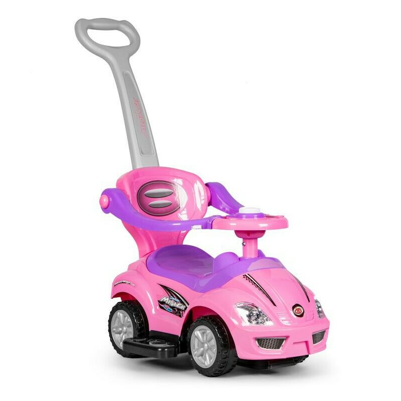
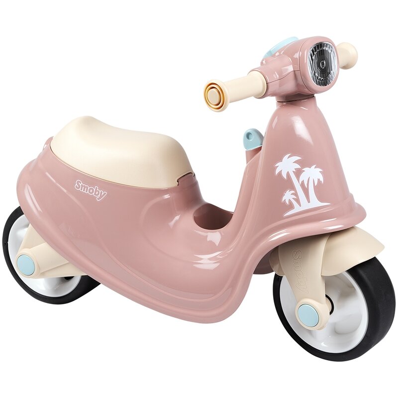
Masinuta Ride-On pentru copii, Multistore, Deluxe Mega Car, volan cu clanxon, spatar si balustrade de protectie, maner de ghidare, suport picioare, element anti-rasturnare, Roz
195,00 lei
Brand: MULTISTORE Vezi oferta pe babyneeds.ro
Evoluție preț
Recenzii
Nu există recenzii până acum.